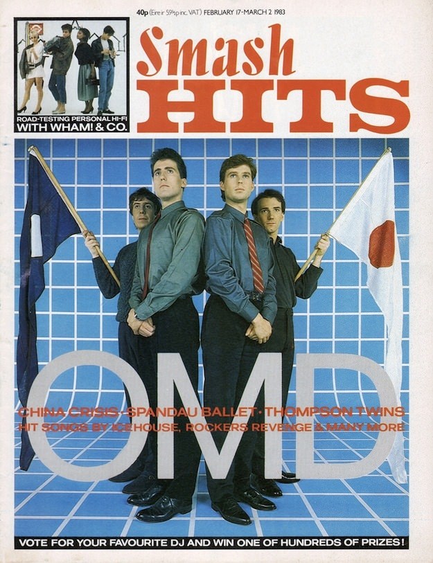
Bold typography and pop-colour confidence make this Smash Hits cover an instant time capsule of 1980s music magazine culture. The masthead dominates the page in classic tabloid style, while the price (40p) and the issue window—February (17–March 2) 1983—anchor it firmly in its moment. Even before you read a single line, the design signals what Smash Hits did best: turn chart pop into something collectible, cheeky, and visually loud.
At centre stage, the band poses with a crisp, graphic backdrop that feels like pure early-’80s set design: a blue grid stretching behind them like a stylised studio infinity wall. Two flags flank the group, adding a playful, slightly theatrical edge that mirrors the era’s fascination with image-making and instant iconography. The oversized “OMD” lettering across the bottom seals the cover’s purpose—star power first, story second—while still leaving space for the magazine’s layered chatter.
Around the main feature, the cover lines hint at the broader ecosystem Smash Hits curated for its readers, with teasers that name-check other major acts and promise polls, prizes, and quick-hit pop journalism. It’s a snapshot of how the magazine sold excitement: a mix of band fandom, consumer culture, and bright design that practically demanded to be pinned to a bedroom wall. For anyone exploring iconic 1980s magazine covers and cover art, this is a sharp example of how Smash Hits turned music into a weekly visual event.