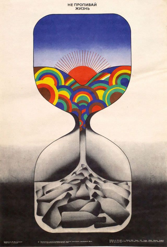
Bold lettering at the top delivers the warning “Don’t drink your life away.”, and the design beneath turns that slogan into a visual parable. An hourglass dominates the page, its upper chamber filled with saturated, rainbow-like arcs and a red sunburst, like a bright horizon compressed into a vessel. The lower chamber, by contrast, collapses into a bleak, rocklike heap in muted grays, suggesting what’s left when time and possibility are squandered.
The poster’s power lies in its simplicity: a single symbol, instantly understood, made memorable through color and contrast. The hourglass reads as both a drinking glass and a measure of time, tying alcohol and lost years together without needing a single narrative scene. Even the clean background space feels intentional, giving the message room to echo like a public warning pinned to a wall and meant to be read in passing.
Dated 1977 in the title, this artwork fits squarely within the tradition of social-issue graphic design, where modernist shapes and minimal text carry moral urgency. It’s an arresting example of anti-alcohol propaganda and late-20th-century poster art, useful for readers interested in visual culture, public health messaging, and the history of persuasion. As a WordPress post feature, it invites viewers to linger on the unsettling question it poses: what disappears, grain by grain, when a life is poured out.