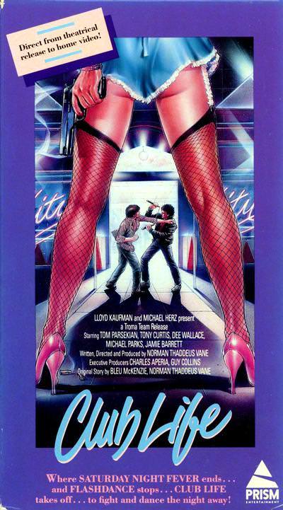
Towering legs in fishnet stockings frame the action like a theatrical proscenium, turning the viewer into an onlooker at the threshold of a neon-lit night. The exaggerated A-frame stance—feet planted wide, hips set as the apex—creates a bold visual gateway that pulls the eye straight down the corridor and into the story. Even before you read a single credit line, the composition sells attitude, seduction, and danger with the blunt confidence of late-20th-century poster art.
At the center of the corridor, two small figures clash in a way that feels almost incidental compared with the monumental foreground, a classic trick of scale that makes the “pose” the true star. That tension between oversized glamour and gritty narrative is exactly why the A-frame became such a durable design shortcut: it promises drama, power, and motion in one instantly readable silhouette. The bright gradients, chrome-like reflections, and nightclub palette reinforce the idea that nightlife itself is the setting—and the stance is the billboard.
From modern fashion editorials to contemporary movie posters, you can still spot this same triangular framing language whenever designers want dominance, allure, or a sense of being “let into” a scene. The A-frame’s influence isn’t just about legs or pin-up styling; it’s about how a body can become architecture, constructing a visual entrance that guides the audience and sets the tone. For anyone tracing the evolution of poster composition, this cover art offers a vivid case study in how an iconic pose keeps reinventing itself across art, advertising, and pop culture.