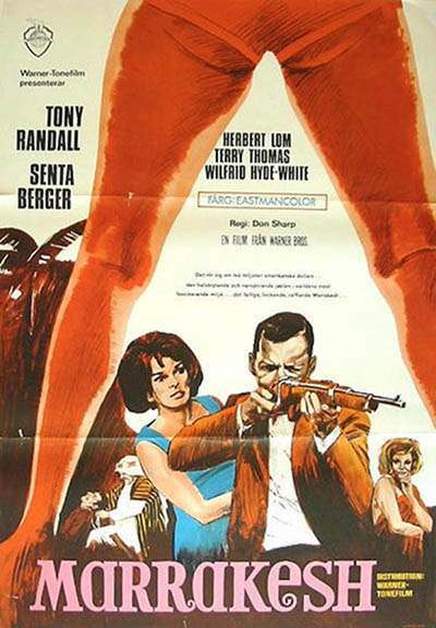
Between a pair of bold, red-orange legs that form a dramatic A-shaped arch, the eye is pulled straight into a scene of danger and allure—an instantly legible piece of cover art that uses the body as architecture. The pose turns negative space into a spotlight, framing the action like a stage proscenium and making the composition feel both cinematic and confrontational. That triangular gateway is the real star here, a visual trick that sells tension before a single line is read.
Typography and illustration work in tandem to amplify the effect: large, confident lettering anchors the lower portion while the central figures—one aiming a rifle, another close behind—suggest a story of pursuit and peril. The surrounding details, including smaller figures and the stylized treatment of clothing and faces, lean into mid-century poster traditions where color blocks and bold outlines carried drama across a crowded street of competing advertisements. Even without full context, the design language communicates pulp intrigue, romance, and imminent violence.
Long before social feeds and modern key art standardized the “hero pose,” designers understood how an A-frame stance could dominate attention and guide narrative focus. That same compositional idea still echoes through fashion editorials that frame models as living portals, gallery posters that weaponize silhouette and symmetry, and movie one-sheets that use legs, doorways, or angular props to funnel viewers toward the lead. For readers tracing the A-Frame’s influence, this artwork offers a clear bridge between classic illustrated publicity and the visual shorthand that continues to shape modern fashion, art, and movie posters.