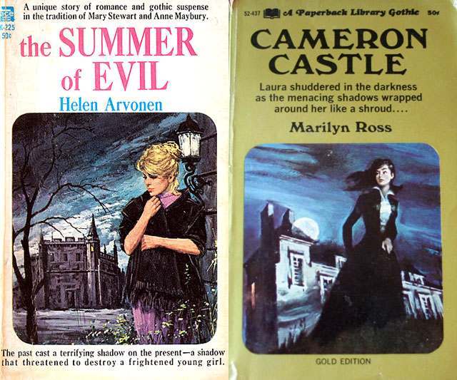
Two paperback Gothic romance covers sit side by side, and both lean hard into the genre’s signature tension between desire and dread. On one, a pensive blonde woman stands foregrounded under a cold sky while a looming mansion recedes behind her; on the other, a dark-haired figure appears poised in motion near a stark house, set against a moonlit, stormy blue. The typography is bold and declarative—titles like “the SUMMER of EVIL” and “CAMERON CASTLE” announce danger as much as romance—while the painted scenes promise that something in the architecture, weather, and shadows is about to break loose.
Gothic romance cover art often turns the house into a character, and these examples show why: the buildings dominate the horizon, packed with implied history, secrets, and threat. The women are styled as vulnerable yet watchful, positioned between the viewer and the estate as if caught in the moment before a decision—enter, flee, or confront what waits inside. Heavy contrast, swirling clouds, and theatrical lighting amplify the psychological pull, making the reader feel the same unsettled anticipation the heroines embody.
Running—or the suggestion of running—becomes the perfect visual shorthand for the genre’s inner drama: a mind torn between curiosity and self-preservation, passion and peril. Even when a figure is standing still, posture and framing hint at escape routes, chase narratives, and the dread of being watched from upstairs windows. For collectors, designers, and fans of vintage paperback Gothic fiction, this kind of cover art remains a masterclass in selling emotion at a glance, pairing romantic fantasy with an immediate, uneasy sense of danger.