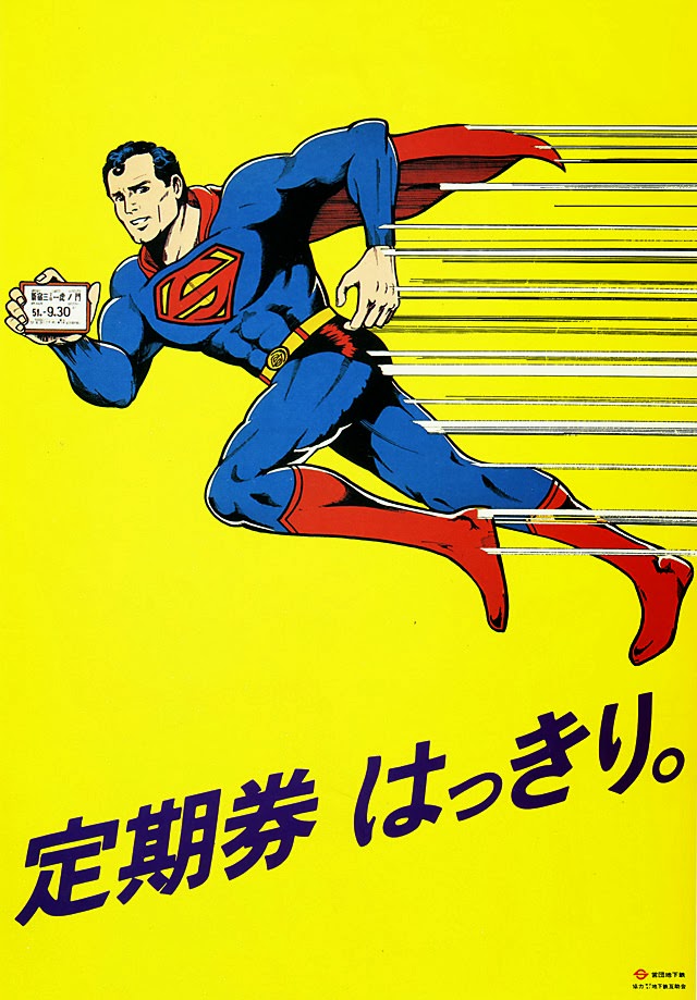
September 1976’s poster-style artwork turns an everyday commuter reminder into something bold and playful: a caped superhero sprints across a bright yellow field, arm extended to display a train pass like a badge of honor. Speed lines slice through the background, and the dynamic pose sells the message at a glance—move quickly, but be ready when asked. The design leans on clean outlines, strong primary colors, and comic-book energy to make public-transport etiquette feel modern and memorable.
Japanese text anchors the lower portion of the image, framing the scene as a clear instruction rather than mere decoration. In the hero’s hand, the small ticket is rendered with just enough detail to read as an official pass, reinforcing the title’s directive to “clearly show your train pass.” It’s advertising as civic guidance, where graphic impact does the work of a platform announcement.
Seen today, the piece offers a vivid snapshot of 1970s visual culture and the way rail systems communicated with riders through illustrated posters. For collectors of retro transit ephemera, Japanese railway graphics, or pop-art-influenced commercial design, this image sits at a fascinating crossroads of humor, authority, and daily routine. The result is both a time capsule and a striking example of how public messaging can borrow the language of superheroes to encourage simple compliance.