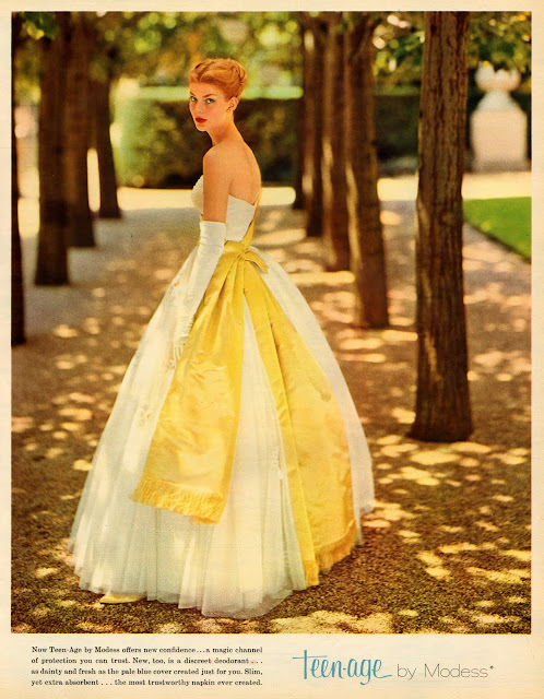
Sunlight filters through a formal row of trees as a young model turns back toward the viewer, her posture poised and self-assured. The gown is all mid-century drama: a strapless bodice, a full skirt with crisp volume, and long opera gloves that telegraph “special occasion” glamour. A bold yellow overlay—part sash, part panel—adds graphic punch against the pale fabric, letting color do the talking the way 1960s fashion photography loved to do.
At the bottom of the cover, the era’s advertising language steps in with the brand line “Teen-age by Modess,” anchoring the artwork in the world of magazine marketing rather than pure editorial fantasy. That juxtaposition is part of what makes Seventeen magazine cover art so revealing: high-style visuals paired with copy meant to feel intimate, modern, and reassuring. Even without specific names or dates, the design cues—type treatment, color palette, and the polished, aspirational mood—signal the consumer-driven optimism aimed at teen readers.
Fashion historians and pop-culture collectors will spot a transitional moment here, where classic silhouette meets a more youthful, “groovy” sensibility communicated through color and attitude. The setting’s manicured path and dappled shade lend a cinematic quality, turning a product pitch into a miniature story about confidence and coming-of-age style. As a WordPress post image, it’s a strong, SEO-friendly window into 1960s fashion, Seventeen magazine aesthetics, and the bold ad art that helped define the decade’s look and voice.