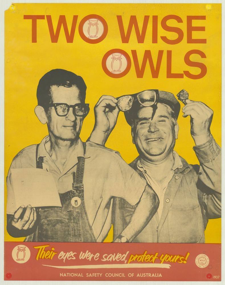
Bold yellow dominates the cover art, topped by the blunt headline “TWO WISE OWLS,” as two workers grin beneath the message. One man holds paperwork while the other lifts protective eyewear, turning a practical safety lesson into a moment of camaraderie. The owl symbols embedded in the lettering reinforce the idea of “wisdom” as something you can wear—literally—on the job.
Along the bottom, the warning lands with a punchy slogan: “Their eyes were saved, protect yours!” It’s classic 1970s poster design—high-contrast photography, minimal text, and a clear focal point—built to be read quickly in a workplace setting. The National Safety Council of Australia branding anchors the campaign, placing eye protection and injury prevention at the centre of everyday working life.
As part of a broader set of National Safety Council of Australia posters from the 1970s, this piece shows how public safety messaging relied on wit, strong colour, and relatable faces rather than dense instruction. For readers interested in Australian social history, occupational health, and graphic design, the poster offers a window into how organisations tried to keep people safe and well through memorable visual communication. It’s a reminder that the smallest habits—like wearing eye protection—were framed as smart choices with life-changing consequences.