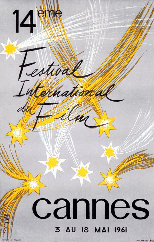
At a glance, A.M. Rodicq’s 1961 cover art for the 14ème Festival International du Film in Cannes feels like a burst of night sky translated into graphic design. Shooting-star streaks in warm yellow arc across a cool gray field, while clustered starbursts sparkle with a celebratory energy that’s both elegant and playful. The hand-lettered “Festival International du Film” adds a lively, human touch, balancing the bold simplicity of the composition.
Mid-century poster aesthetics come through in the confident contrast: sweeping brushlike trails against a restrained background, and a clean, weighty “cannes” anchoring the bottom. Rather than crowding the viewer with imagery, Rodicq lets a few well-chosen elements suggest glamour, movement, and anticipation—perfect themes for an international film festival. The result is minimal yet festive, a design that reads instantly even from a distance.
Printed details place the event from 3 au 18 mai 1961, making this a vivid piece of Cannes Film Festival history as well as a striking example of French graphic art. For collectors of vintage film posters, classic festival ephemera, or 1960s design, it’s easy to see why this one endures: simple lines, bright stars, and a timeless sense of cinematic occasion. As cover art, it invites the viewer in the way great cinema does—by promising wonder without overexplaining it.