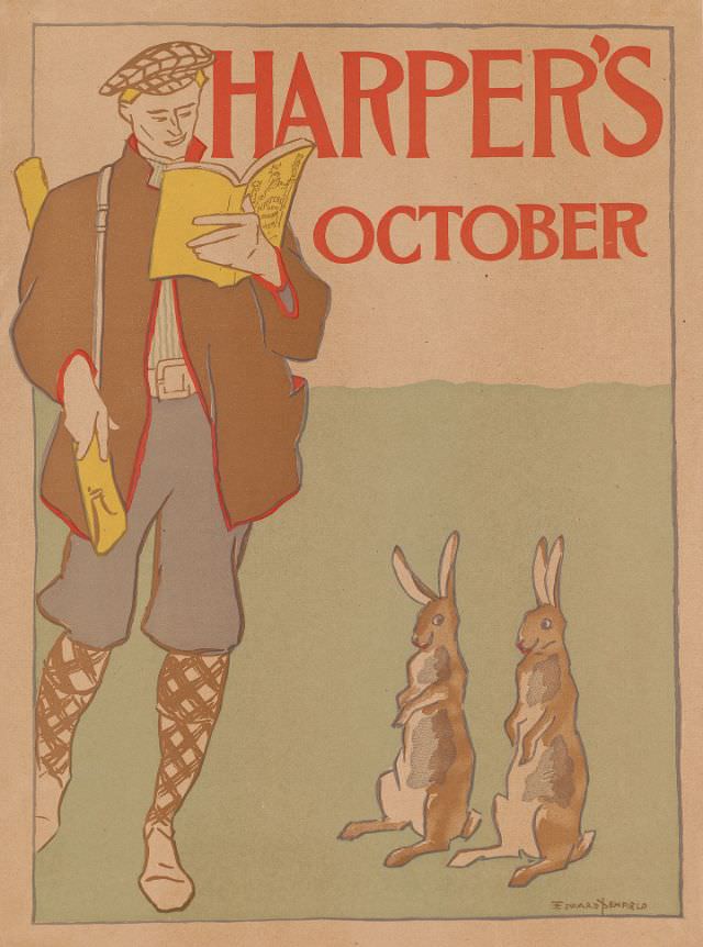
Bold red lettering announces “HARPER’S” and “OCTOBER” above a softly colored scene that feels poised between the indoors and the open field. At left, a man in sporting gear—cap, jacket, knickerbockers, and patterned stockings—stands absorbed in a copy of Harper’s New Monthly Magazine, a yellow cover bright against the muted background. Tucked under one arm is another yellow item, echoing the magazine’s color and drawing the eye back to the act of reading.
Down at ground level, two rabbits sit upright like attentive spectators, their ears angled toward the reader as if listening in on the latest installment. The gentle humor of their watchful posture turns a simple cover illustration into a small narrative: leisure time, print culture, and the outdoors meeting in a single moment. With its clean outlines and restrained palette, the artwork balances whimsy with the tidy graphic impact typical of magazine cover art from the period.
As a piece of Harper’s October 1895 cover art, the illustration offers a window into how late-19th-century publications sold an idea of modern recreation—well-dressed, self-contained, and pleasantly literate. The contrast between the man’s confident stance and the rabbits’ curious stillness adds charm without clutter, making the composition instantly readable even at a glance. Ideal for a WordPress post on Harper’s magazine history, vintage illustration, or Gilded Age visual culture, it’s a reminder that a magazine cover could be both advertisement and story.