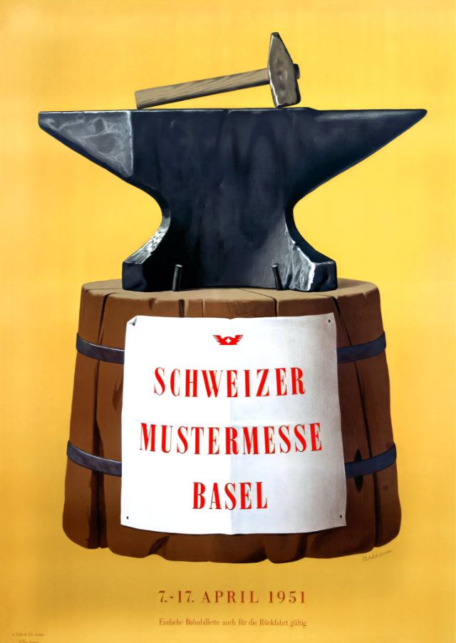
Bold graphic symbolism anchors this poster for the Schweizer Mustermesse Basel, pairing an anvil and hammer with a stout wooden barrel and a warm yellow field. The composition is strikingly direct: heavy tools at the top, strong typography in red at center, and the fair’s identity made unmistakable by the large “Schweizer Mustermesse Basel” lettering. At the bottom, the dates “7.–17. April 1951” situate the design firmly in the postwar era of renewed trade and confident public messaging.
Industry and craft are the clear themes, with the anvil evoking metalwork, manufacturing, and the pride of skilled labor, while the barrel hints at cooperage, commerce, and everyday goods. That combination reads like a visual promise—practical products, technical know-how, and Swiss-quality workmanship gathered under one roof. The clean, poster-like simplicity also reflects mid-century advertising aesthetics, where a single emblematic scene could stand in for an entire marketplace of innovation.
For anyone researching Basel history, Swiss trade fairs, or mid-century European design, this 1951 Mustermesse image offers an inviting entry point. It’s both an artwork and a marketing artifact: a snapshot of how fairs presented themselves as engines of modern life, connecting producers and visitors through memorable visual language. As a WordPress feature, it brings instant atmosphere to topics like Swiss industrial heritage, exhibition culture, and the evolving look of graphic design in the early 1950s.