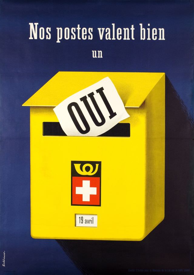
Bold French lettering—“Nos postes valent bien un oui”—floats above a bright yellow mailbox, turning a simple everyday object into a persuasive symbol. A slip of paper stamped “OUI” is poised at the slot, as if the decision has already been made, while the crisp blue background and clean, modern shapes give the whole design the punch of mid-century graphic art. The Swiss cross and postal emblem on the front anchor the message in public life and national identity, and a small “19 avril” label hints at a date meant to be remembered.
Dated in the title to 1953, this poster-style image reads like an invitation to trust institutions at a moment when mail, ballots, and official notices carried enormous weight. The composition relies on contrast—yellow against deep blue, black text against white paper—to make the “yes” impossible to miss, and the oversized mailbox suggests a civic act larger than personal correspondence. Even without further context, the visual language feels unmistakably promotional: clear, optimistic, and designed for quick recognition from the street.
For a WordPress post about historical posters and public communication, “Nos postes valent bien un oui” offers a striking example of how design and messaging converged in the early 1950s. It’s as much an artwork as it is a piece of social history, reflecting the era’s confidence in streamlined typography, strong color blocks, and state-linked symbols. Readers interested in vintage advertising, Swiss graphic design, and postal history will find plenty to linger over in the details—and in the quiet drama of a single word about to be posted.