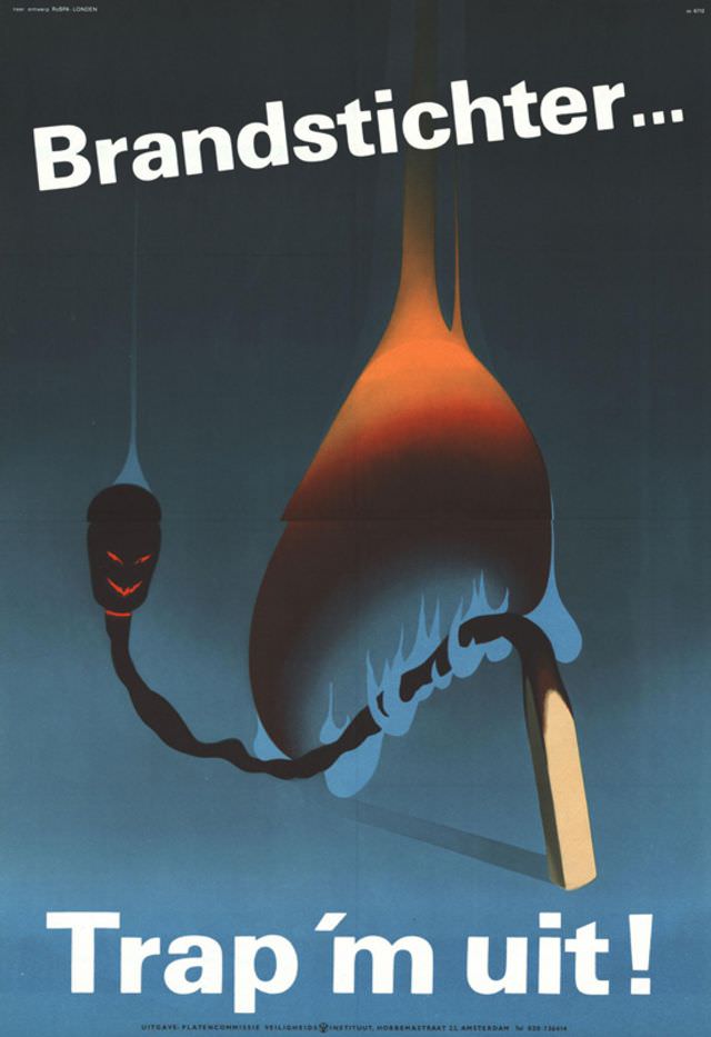
Bold Dutch lettering—“Brandstichter…” and the urgent command “Trap ’m uit!”—sets the tone for this striking 1967 design, where typography does as much work as the imagery. The poster’s message reads like a warning shouted across a street, framed by wide fields of cool blue that make the white text feel immediate and unavoidable. Even without an identified designer, the composition speaks confidently in the visual language of mid-century public communication.
At the center, a single match becomes a stage for menace: a glowing head, a lick of blue flame, and curling smoke that twists into a sinister, mask-like face. The warm orange-red gradient against the darker background suggests heat, danger, and the speed at which one small act can turn into catastrophe. Minimal elements are used with maximum impact, turning everyday objects into symbols of arson and alarm.
Viewed today, “Designer unknown, 1967” stands as a vivid example of European graphic poster art aimed at public safety and civic responsibility. Its cinematic contrast, simplified shapes, and psychologically charged metaphor make it memorable for collectors and researchers interested in 1960s poster design, anti-arson campaigns, and the history of visual persuasion. As an artwork, it’s both a warning and a masterclass in how design can make fear legible without showing a single scene of destruction.