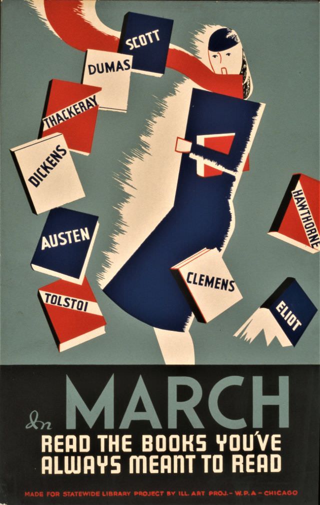
Bold, modern graphics pull you in with a figure striding forward, arms full of books, as famous author names—Scott, Dumas, Thackeray, Dickens, Austen, Tolstoi, Clemens, Hawthorne, and Eliot—seem to orbit in midair. A limited palette of deep blue, red, cream, and gray gives the design a crisp urgency, while sharp angles and cut-paper shapes evoke the streamlined look of 1930s American poster art. The message lands in large type at the bottom: “In March, read the books you’ve always meant to read.”
Though the post title references the Federal Music Project and free instruction in music, the artwork shown reads as a promotional poster for a library reading campaign connected to the WPA. That mismatch is a useful reminder of how New Deal–era cultural programs overlapped—visual artists, educators, and public institutions all aimed to widen access to learning and the arts. Here, the focus is literary: a call to self-improvement and curiosity, delivered with the same democratic spirit that powered publicly funded culture in the late 1930s.
For WordPress readers interested in American history, graphic design, or WPA posters, this piece offers a vivid snapshot of how public outreach looked before television and social media. It’s both advertisement and aspiration, using recognizable writers’ names as a promise that great books are within reach. Whether you’re researching New Deal public art or simply collecting vintage poster imagery, the design’s energy still feels like an invitation to pick up a long-delayed classic.