Category: Cover Art
Dive into a gallery of vintage cover art from books, magazines, and albums. Discover how graphic design and illustration reflected the moods of their times.
These covers capture the essence of cultural evolution — from bold propaganda to elegant minimalism.
-
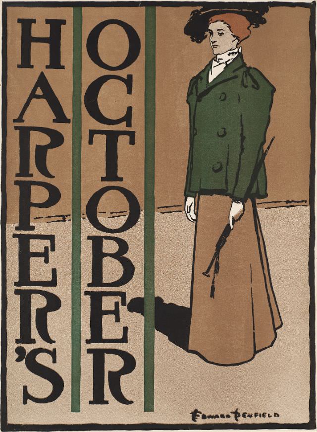
#36 A woman stands holding a crop, Harper’s October, 1897
Bold lettering spelling out “HARPER’S” and “OCTOBER” frames a striking cover design, immediately situating the piece in the world of late‑nineteenth‑century magazine illustration. The palette is restrained yet confident—deep greens, warm browns, and inky black lines—giving the composition a poster-like clarity that would have stood out on a newsstand. Even before the figure is studied,…
-
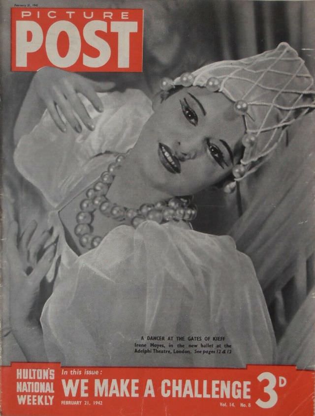
#7 We Make A Challenge, Picture Post, February 21st, 1942
Bold, theatrical glamour fills the cover of *Picture Post* under the rallying headline “We Make A Challenge,” dated February 21st, 1942. A dancer is posed in soft light, reclining against draped fabric, her face turned toward the viewer with stage-ready makeup and a calm, confident gaze. The styling leans into performance and fantasy: a netted…
-
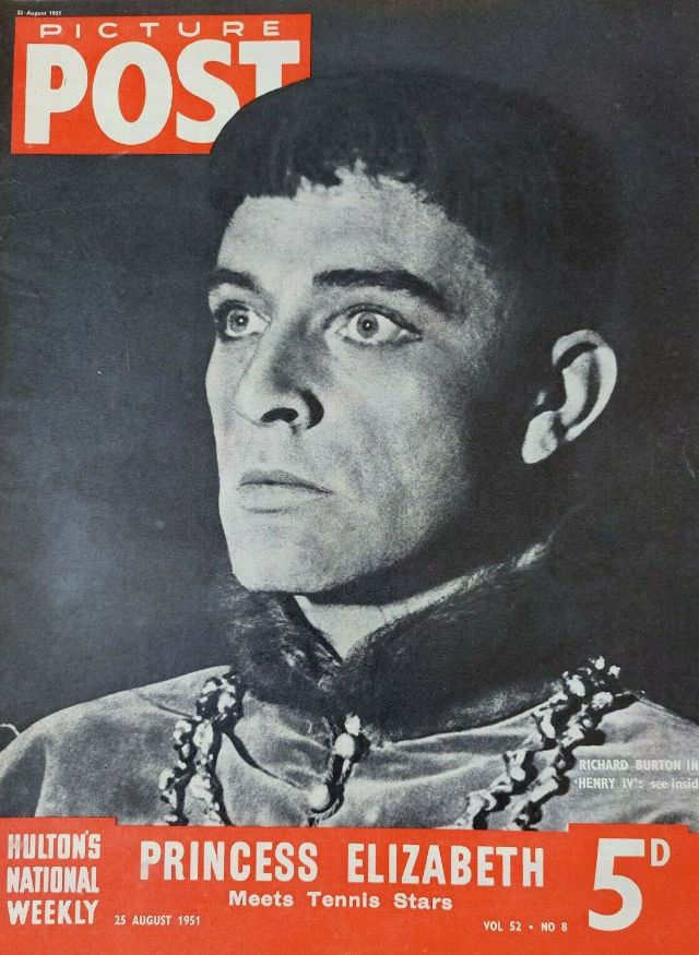
#23 Richard Burton, Picture Post, August 25th, 1951
A bold block of “PICTURE POST” crowns the page while Richard Burton’s intense, upward gaze dominates the cover, rendered in stark monochrome against a dark background. The portrait has the feel of stage-lighting—high contrast, crisp features, and a sense of concentration—suggesting a dramatic role rather than a casual studio sitting. Decorative costume details at the…
-
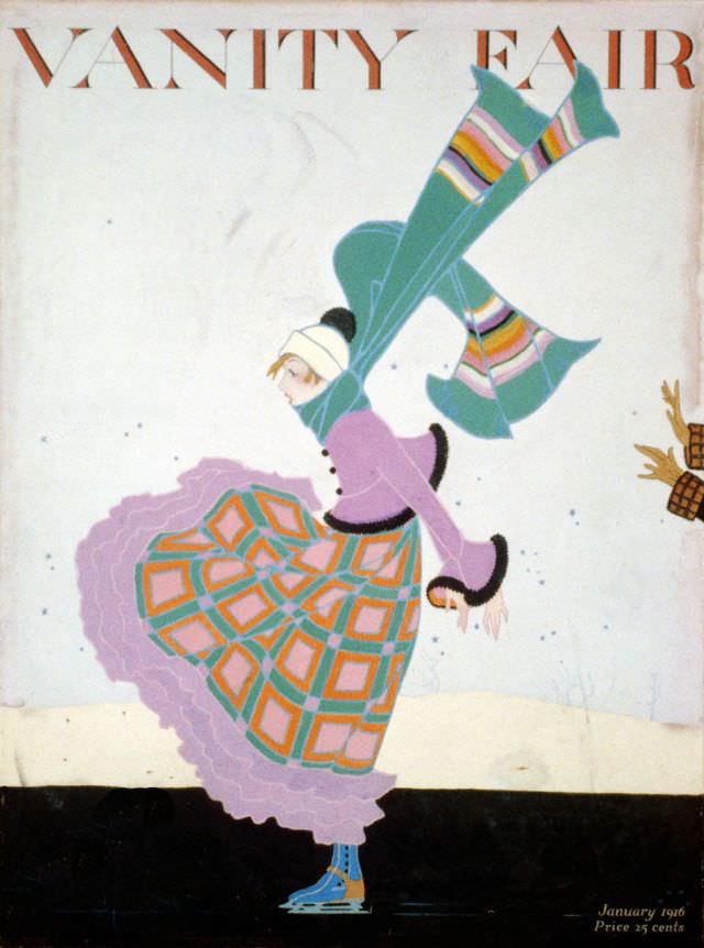
#4 Vanity Fair cover, January 1916
A gust of winter wind seems to sweep straight across the January 1916 Vanity Fair cover, lifting a long teal scarf into the air and tugging at a fashionable figure dressed for the season. The illustration leans into movement rather than stillness: a tilted posture, a fluttering hem, and a sense of brisk weather that…
-
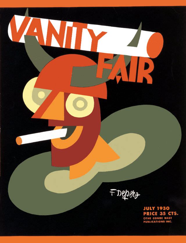
#20 Vanity Fair cover, July 1930
Bold geometry and sly humor dominate the Vanity Fair cover for July 1930, where a stylized figure peers out through round spectacles beneath curving, horn-like shapes. A cigarette juts from a smiling mouth, and the palette—burnt orange, olive green, cream, and deep black—leans into the crisp, modern look associated with Art Deco-era design. The oversized…
-

#36 Vanity Fair cover, April 1935
Bold lettering for “VANITY FAIR” crowns this April 1935 cover, where a ringmaster in a bright red jacket raises his arms as if conducting a spectacle just beyond the page. The art leans into theatrical exaggeration—arched eyebrows, sweeping gestures, and a tiny birdcage perched above like a prop in a visual joke. Even before reading…
-
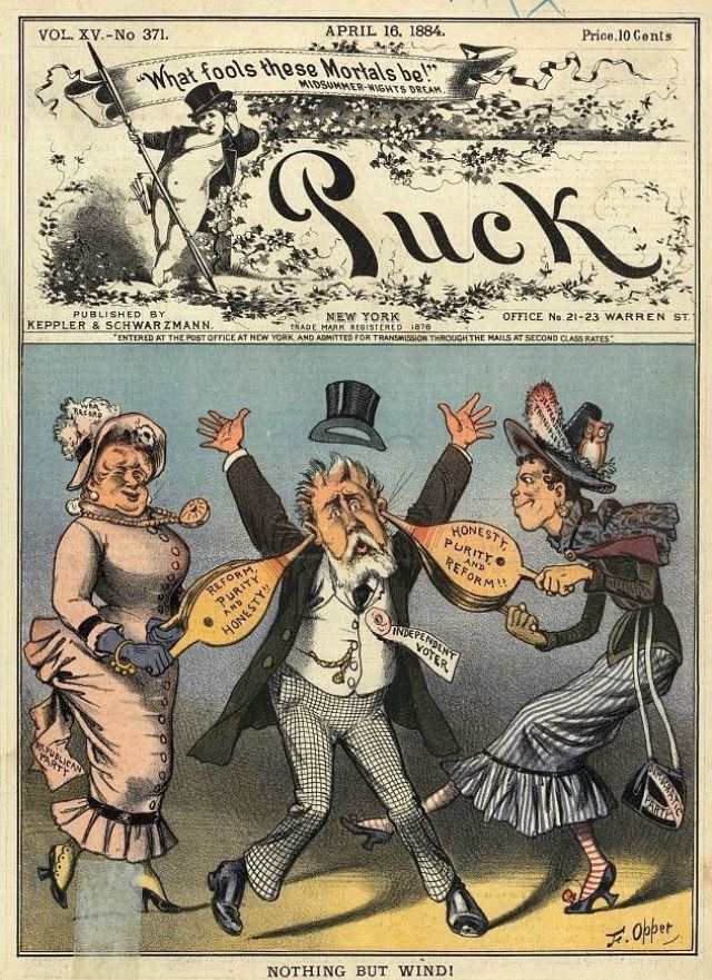
#12 Puck magazine cover, April 16, 1884
Bold lettering spells out “Puck” beneath a springtime banner dated April 16, 1884, with the magazine’s New York imprint and its familiar air of theatrical mischief. The top vignette frames the title like a stage proscenium, complete with a ribboned quotation—“What fools these mortals be!”—that signals the satirical tone inside. Even before the main scene…
-
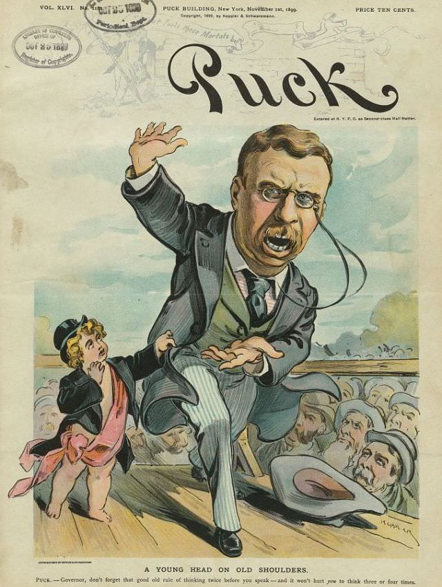
#44 Puck magazine cover, November 1, 1899
Boldly lettered “Puck” crowns this November 1, 1899 magazine cover, a vivid slice of Gilded Age satire rendered in color. At center, a mustachioed man in a dark suit and striped trousers lurches forward on a wooden platform, one arm raised as if caught mid-speech, the other thrust out for balance. Behind him, a small…
-
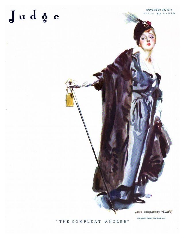
#16 Judge magazine, November 28, 1914
Elegance takes center stage on the cover of *Judge* magazine dated November 28, 1914, where a stylish woman poses with the cool assurance of someone used to being watched. A feathered hat crowns her neatly arranged hair, and her expression—half aloof, half amused—adds a theatrical note that suits the magazine’s famed wit. The title “Judge”…