Category: Cover Art
Dive into a gallery of vintage cover art from books, magazines, and albums. Discover how graphic design and illustration reflected the moods of their times.
These covers capture the essence of cultural evolution — from bold propaganda to elegant minimalism.
-
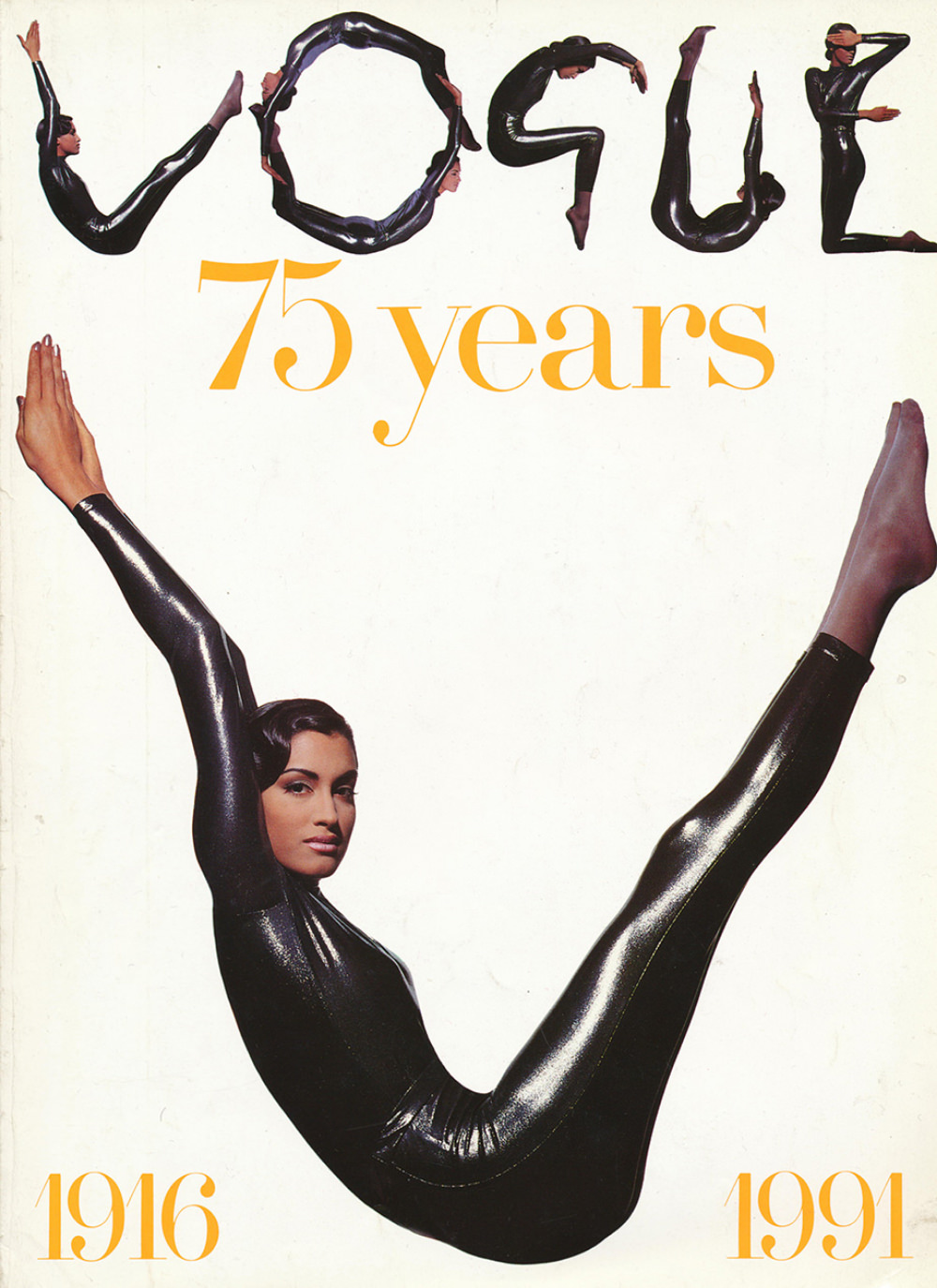
#4 Model Yasmeen Ghauri is dressed in a metallic bodysuit by Karl Lagerfeld. Photographed by Tyen for British Vogue’s Special Edition 75th Anniversary issue in June, 1991.
Across a clean white field, Yasmeen Ghauri’s body becomes both subject and typography, her metallic bodysuit catching the light like liquid armor. Above her, smaller, acrobatic silhouettes spell out “VOGUE,” turning the magazine’s name into a playful ballet of limbs. The bold gold “75 years” anchors the composition, with the anniversary span printed at the…
-
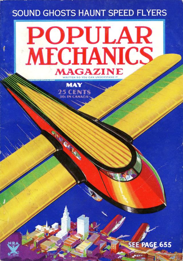
#15 Popular Mechanics magazine cover, May 1934
Bold red lettering and a deep blue field set the stage for the May 1934 cover of Popular Mechanics magazine, a striking piece of cover art that immediately signals speed, modernity, and confidence in technology. A streamlined airplane dominates the composition, angled as if it’s banking over the reader, its bright yellow wings and glossy…
-
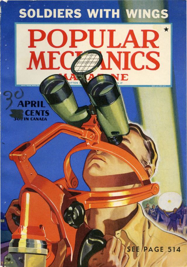
#31 Popular Mechanics magazine cover, April 1941
Bold color and confident lettering make the April 1941 Popular Mechanics magazine cover feel like a poster for the machine age. Across the top, the phrase “SOLDIERS WITH WINGS” frames the moment, while the familiar red Popular Mechanics title sits behind a striking illustration of a serviceman looking upward through an optical device. Even the…
-
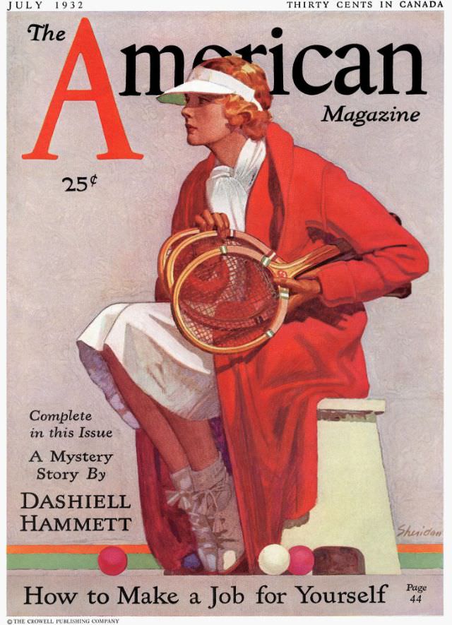
#7 The American Magazine cover, July 1932
Bold lettering and a confident, modern illustration set the tone on this July 1932 cover of *The American Magazine*. A stylish woman sits in profile, wrapped in a vivid red coat over a pale dress, her white visor catching the light while she steadies a pair of wooden tennis racquets in her lap. The clean…
-
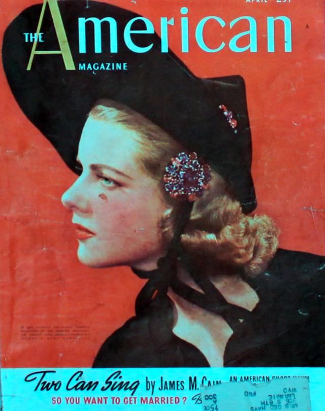
#23 The American Magazine cover, April 1938
April 1938 arrives in a burst of saturated color on the cover of The American Magazine, where a poised profile dominates the page against a warm red field. The elegant typography—“American” sweeping across the top—anchors the design in the confident visual language of late-Depression-era publishing, when magazine racks competed with bold palettes and instantly readable…
-
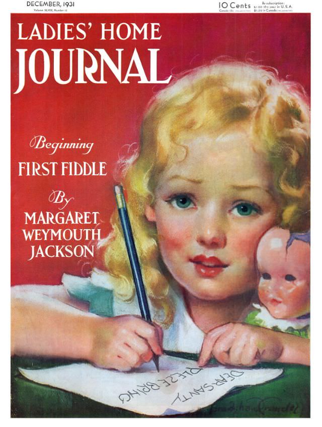
#1 Ladies’ Home Journal, December 1931
December 1931 arrives in bold red and crisp white lettering on the Ladies’ Home Journal cover, instantly signaling a confident, modern magazine presence. Centered beneath the masthead, a golden‑haired child leans close to the viewer, cheeks flushed and eyes bright, her face rendered with the soft, idealized polish typical of early 20th‑century cover art. The…
-
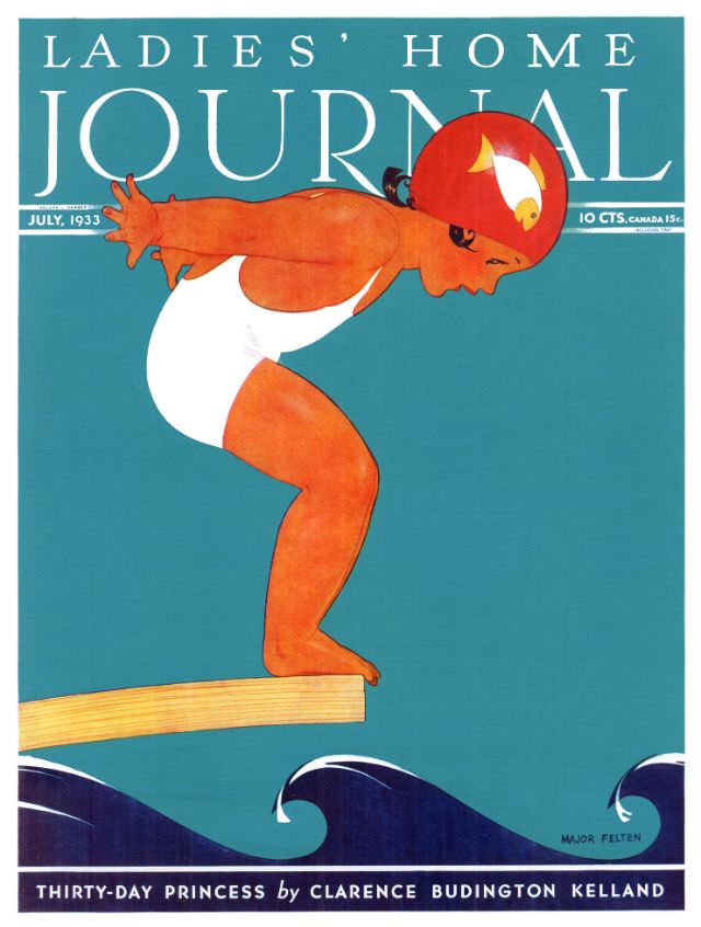
#17 Ladies’ Home Journal, July 1933
Bold lettering crowns the page as a swimmer in a bright red cap crouches on a springboard, poised between breath and plunge. Against a cool teal field, the figure’s warm, sunlit tones and clean white suit create a striking Art Deco contrast, while stylized navy waves curl below like a stage set for summer. The…
-
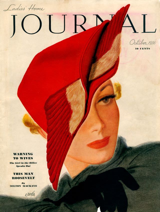
#33 Ladies’ Home Journal, October 1936
Bold typography stretches across the top of the Ladies’ Home Journal cover, while a stylish portrait takes center stage in unmistakable 1930s fashion. A dramatic red hat—folded and pleated like a sculpted ribbon—frames the woman’s face, its rich color balanced by soft, airbrushed skin tones and carefully defined lashes. The overall design feels modern for…
-
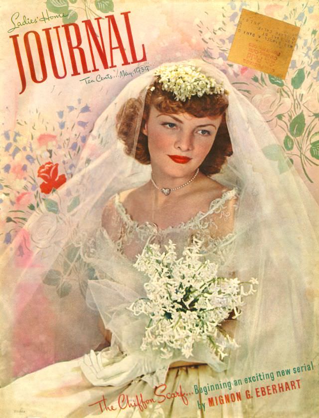
#49 Ladies’ Home Journal, May 1939
Soft watercolor florals and the bold red “Journal” masthead set an instantly recognizable mood on the Ladies’ Home Journal, May 1939 cover. At center, an elegant bride poses with a composed, thoughtful expression, framed by a sheer veil and a delicate crown of tiny white blossoms. The palette leans warm and romantic—pinks, creams, and gentle…
-
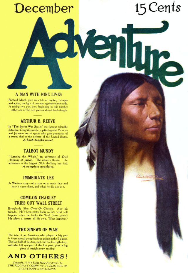
#6 Adventure cover, December 1914
Bold typography and a striking profile portrait set the tone on the December 1914 cover of *Adventure*, priced at 15 cents and designed to catch the eye from a crowded newsstand. The masthead sprawls across the top while a vertical band of text on the left stacks story titles like a promise of nonstop action.…