Category: Cover Art
Dive into a gallery of vintage cover art from books, magazines, and albums. Discover how graphic design and illustration reflected the moods of their times.
These covers capture the essence of cultural evolution — from bold propaganda to elegant minimalism.
-
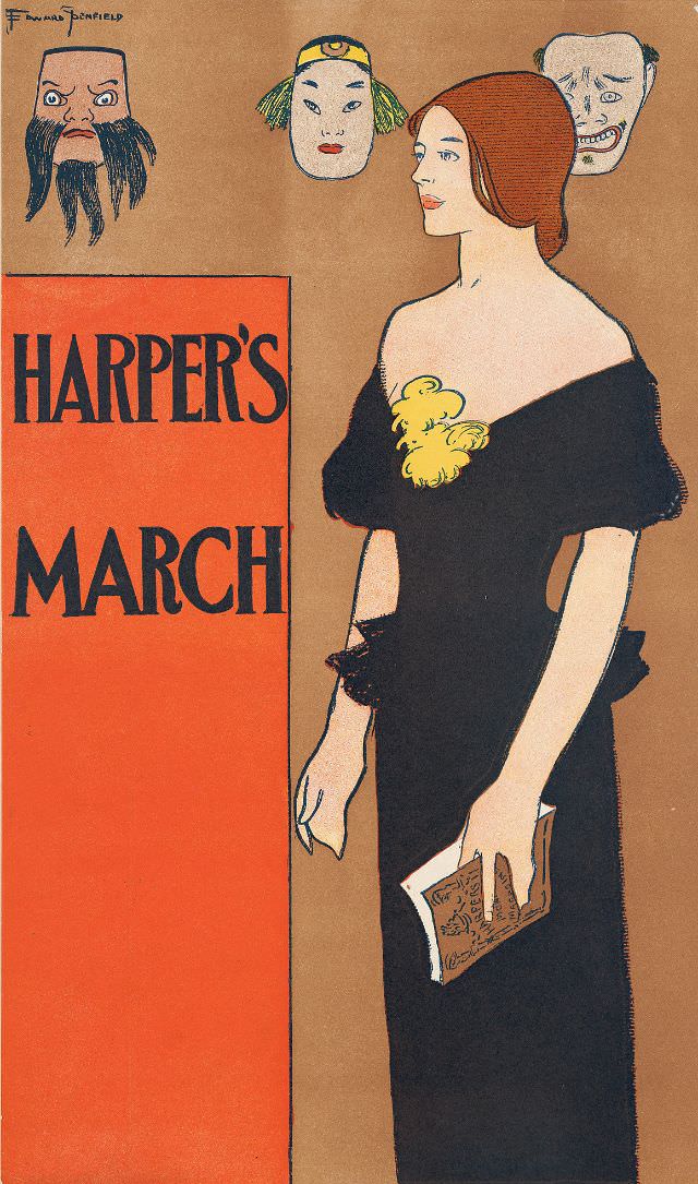
#28 A woman stands holding a magazine with three masks behind her, Harper’s March, 1896
Against a warm, minimalist background, a poised woman in a dark, off-the-shoulder gown turns in profile while holding a magazine at her side, her gloved hand and neat hairstyle underscoring a polished, late‑19th‑century elegance. The bold block lettering reading “Harper’s March” anchors the design like a poster, balancing fashion illustration with the graphic punch of…
-
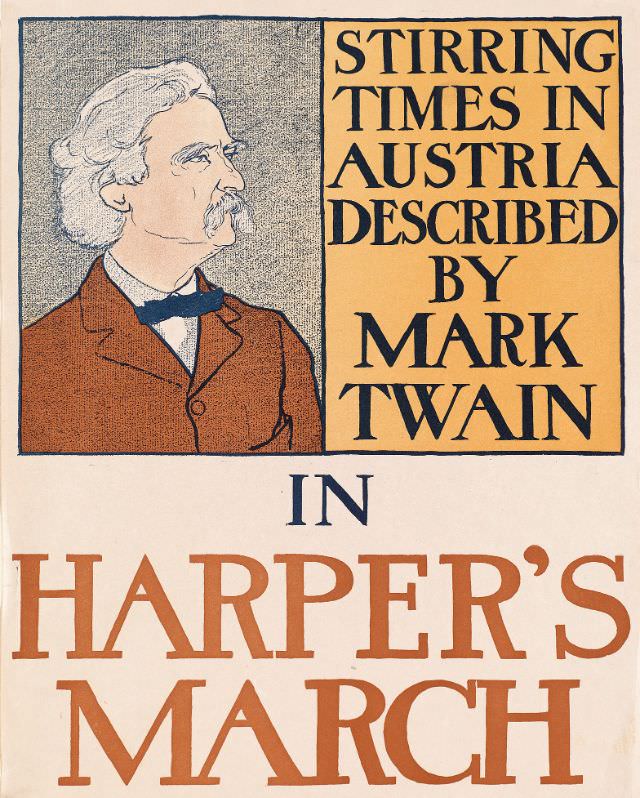
#44 Stirring times in Austria described by Mark Twain in Harper’s March, 1898
Bold typography and a warm, restrained palette pull you straight into a magazine cover that announces “Stirring Times in Austria Described by Mark Twain” with unmistakable late-19th-century confidence. At left, an illustrated profile of Twain—white hair, prominent mustache, and formal suit—faces the headline, as if listening in on the political and cultural currents promised by…
-
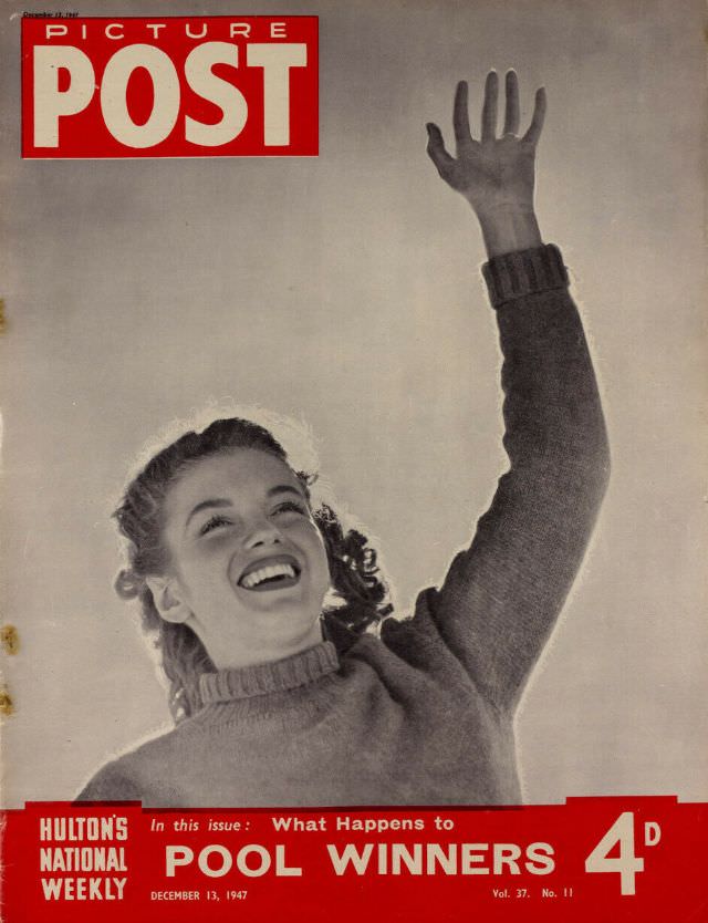
#15 Marilyn Monroe, Picture Post, December 13th, 1947
A bold red masthead and a sweep of open sky frame a young Marilyn Monroe in a moment of pure, upward-looking delight, her raised hand cutting a diagonal line that gives the cover its lift. The styling feels casual and approachable—knit sweater, wind-touched hair, bright smile—yet the composition is unmistakably magazine-ready, built to stop a…
-
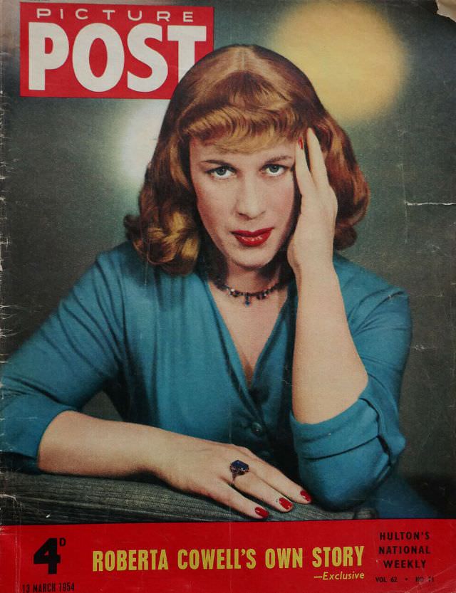
#31 Roberta Cowell, Picture Post, March 13th, 1954
Bold “PICTURE POST” lettering crowns this March 13th, 1954 cover, setting the tone for a classic mid-century magazine moment. Roberta Cowell is posed close to the camera with a steady, direct gaze, auburn waves neatly set and fringe cut sharp across the forehead. The studio styling leans into glamour—red lipstick, polished nails, and a simple…
-
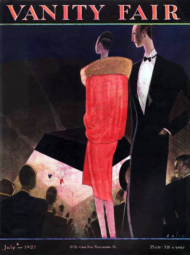
#12 Vanity Fair cover, July 1927
Bold letters spell “VANITY FAIR” across the top of this July 1927 cover, framing an evening scene rendered in sleek, modern shapes. At center, a poised woman in a vivid red dress with a broad fur-like stole stands beside a man in a sharp black tuxedo and bow tie, their turned profiles suggesting elegance with…
-

#28 Vanity Fair cover, April 1933
Bold typography crowns the April 1933 Vanity Fair cover, where a dramatic red sky frames a skyline of sleek, towering modernist buildings. The composition leans into streamlined geometry—sharp angles, clean verticals, and simplified shadows—giving the city an almost theatrical presence that feels both glamorous and slightly ominous. Even at a glance, the cover art broadcasts…
-
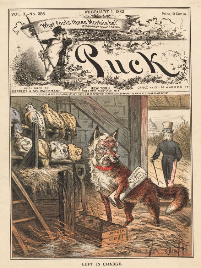
#4 Puck magazine cover, February 1, 1882
Bold, theatrical lettering spells out “Puck” beneath a banner dated February 1, 1882, with a mischievous sprite aloft quoting “What fools these mortals be!”—a wink to Shakespeare that sets the tone for satire. The cover’s lush color printing and ornate framing reflect the magazine’s knack for turning political commentary into eye-catching popular art. Even the…
-
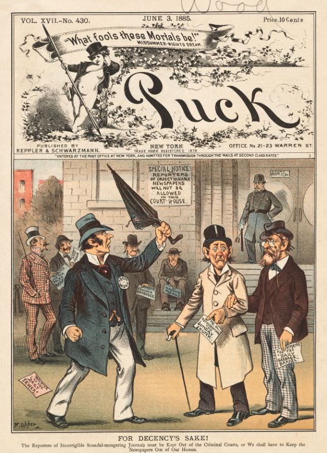
#20 Puck magazine cover, June 3, 1885
Bold lettering spells out “Puck” beneath a ribbon that asks, “What fools these mortals be!”—a fitting motto for the magazine’s sharp-edged humor. The June 3, 1885 cover (Vol. XVII, No. 430) presents itself as a polished piece of 19th-century print culture, complete with the price line and publication details that place it firmly in the…
-
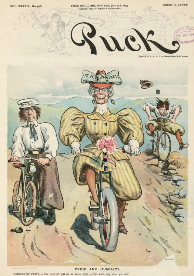
#36 Puck magazine cover, July 3, 1895
Bold lettering announces *Puck* across the top of this July 3, 1895 cover, a reminder of how the magazine blended eye-catching design with sharp political humor. The masthead details place the issue at the “Puck Building, New York,” priced at ten cents, with a softly sketched scene behind the title that frames the satire below.…
-

#8 Judge magazine, January 11, 1913
January 11, 1913 sits neatly atop this Judge magazine cover, where a poised young woman occupies a dressing-table chair in a softly stylized interior. The palette leans into warm pinks and creams, punctuated by bold navy striping on her fashionable dress, while bright red heels add a confident finishing note. Above the scene, the crisp…