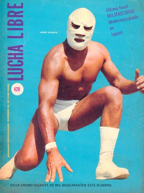
Against a bright turquoise field, a masked wrestler drops into a low, ready stance, one knee bent and one hand reaching toward the mat as if the next hold is already in motion. The stark white mask and matching trunks and boots turn the body into a bold graphic silhouette, while the magazine’s vertical “LUCHA LIBRE” masthead anchors the composition like a ringside banner. It’s cover art that sells speed and strength in a single pose, pairing athletic realism with the heightened drama that defined lucha libre on newsstands.
Spanish cover lines push the spectacle further, promising urgent revelations and far-flung intrigue, and the text layout is as punchy as a poster. A small issue number appears in a circle, and additional copy teases special inserts and collectible extras, reminders that these publications were part sports journalism, part pulp entertainment, and part fan scrapbook. Even without a visible arena, the design conjures the roar of the crowd—mask as mystery, muscles as myth, and the page itself as a stage.
For anyone exploring 1970s lucha libre magazine covers, this piece is a vivid snapshot of how Mexican wrestling culture was packaged: clean colors, dramatic posing, and headlines built for impulse buys. The look fits the era’s broader pop aesthetics while staying rooted in the unique language of masked heroes and public personas. As a visual tour through classic cover art, it highlights why lucha libre remains so photogenic—where every stance, stitch, and shadow reads like a story waiting for the bell.