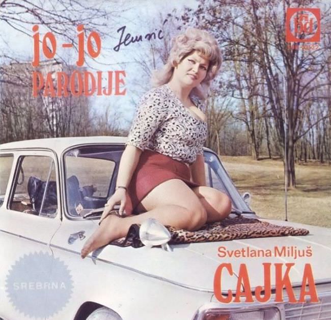
Leopard print, a posed pin‑up stance, and a pristine white car hood set the tone for this piece of Yugoslav album cover art—an aesthetic that aimed for glamour but often landed in something closer to awkward spectacle. The composition leans hard on bold red lettering (“jo‑jo,” “parodije,” and the large title “CAJKA”), with the performer’s name, Svetlana Miljuš, anchored near the bottom to make sure no one misses the sales pitch. A park-like background of bare trees and pale sky frames the scene, giving it a strangely everyday backdrop for a cover trying to feel risqué and modern.
What makes imagery like this so memorable in the context of 1970s and 1980s Yugoslav music marketing is the collision of aspiration and limitation: studio gloss meets outdoor improvisation, and pop seduction is staged with whatever props feel “Western” enough—cars, animal prints, oversized typography. The performer is turned into the main graphic element, while the landscape and vehicle act as shorthand for freedom, leisure, and status. Even without a clear date on the artwork itself, the styling choices evoke the era’s taste for loud contrasts and direct, attention-grabbing design.
In a post about the ugly truth behind Yugoslavian album art, this cover works as a case study in how commercial pressure could flatten artistry into cliché—especially for female performers, whose bodies were routinely used as the quickest route to visibility. At the same time, the cover is a historical artifact: it preserves fashion, graphic design habits, and the consumer imagination of the late socialist pop market in a single frame. If you’re researching Yugoslav record sleeves, Balkan cover art, or the visual culture of regional pop and folk, details like the typography, the staged automobile glamour, and the outdoor setting are exactly where the story starts to reveal itself.