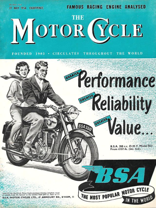
Bold turquoise color blocks and crisp mid-century lettering make the May 27, 1954 cover of The Motor Cycle magazine instantly recognizable on a shelf. The masthead dominates the top, flanked by promises of technical authority—most notably the line about a “famous racing engine analysed”—signaling a publication aimed at riders who cared as much about engineering as adventure. Even the cover price and the proud claim of worldwide circulation underscore how established the magazine already was.
Front and center, the cover art turns sales pitch into story: a smiling couple rides a BSA 350, illustrated with the clean, idealized confidence common to 1950s British motorcycle advertising. Slogans like “Greater Performance,” “Greater Reliability,” and “Greater Value” are arranged to pull the eye across the page, while the bike’s headlamp, tank badge, and number plate detail anchor the artwork in recognizable hardware. The result is less a single moment than a lifestyle promise—speed and modernity, but also everyday practicality.
Collectors of vintage motorcycling ephemera will appreciate how this issue works as both magazine cover and period advertisement, capturing what manufacturers and publishers wanted riders to believe about two-wheeled travel. It’s a useful visual reference for anyone researching postwar motorcycle culture, BSA branding, or the graphic design language of the era. For WordPress archives focused on classic bikes and motoring history, this cover art offers an eye-catching, SEO-friendly glimpse into 1954’s mix of aspiration, technology, and road-going romance.