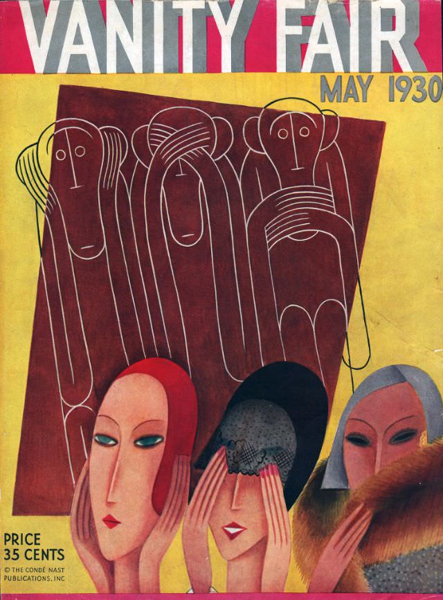
Bold blocks of red, ochre, and chocolate-brown set the stage for the Vanity Fair cover dated May 1930, a striking example of early 20th-century magazine design. Across the top, the towering masthead competes for attention with the clean “MAY 1930” lettering, while a small note at the lower left—“PRICE 35 CENTS” and the Condé Nast imprint—anchors the artwork in the world of mass-circulation publishing. The overall layout feels modern and deliberate, built to catch the eye from a newsstand rack.
Three stylized women dominate the foreground, their faces elongated and mask-like, with cool, knowing expressions that read as both fashionable and slightly aloof. One figure lifts gloved hands toward a dark veil, another turns in profile with sleek hair and lipstick, and a third is wrapped in what appears to be a luxurious fur collar, suggesting the era’s fascination with glamour and display. Behind them, simplified line-drawn figures crowd together like a silent audience, turning the scene into a playful commentary on society, spectatorship, and the performance of style.
As cover art, the May 1930 issue works like a visual time capsule: it distills the aesthetics of the period into sharp geometry, controlled color, and theatrical attitude. The contrast between the polished women in front and the sketch-like crowd behind hints at class, celebrity, and the uneasy dance between individuality and conformity. For collectors and historians of magazine covers, graphic design, and 1930s fashion illustration, this Vanity Fair front page remains instantly readable—and still surprisingly contemporary in its graphic punch.