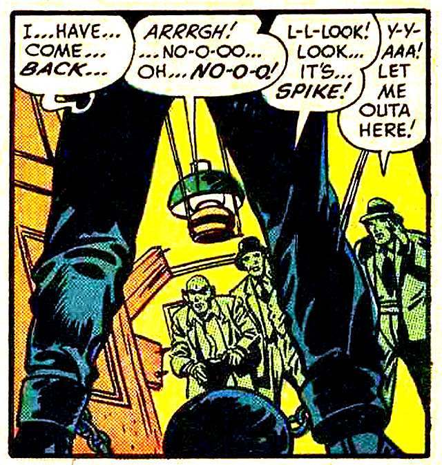
Towering legs dominate the frame while three anxious figures look up from below, their speech balloons spilling panic into the scene—“It’s… SPIKE!” and “Let me outa here!” The composition leans hard on the A‑frame stance: feet planted wide, knees bent, the body forming a threatening triangle that fills the foreground. Even without a clear face, the pose turns the figure into a symbol of power, letting scale, shadow, and silhouette do the storytelling.
From a design perspective, the panel reads like a lesson in visual hierarchy and forced perspective, using the low viewpoint to make the central figure feel inescapable. Heavy outlines, bold blocks of color, and a single hanging lamp create a stagey spotlight effect, pushing the eye from the wide-set legs to the startled onlookers and back again. That triangular “A” shape isn’t just a stance—it’s a compositional engine that anchors the page and heightens tension in one glance.
Modern fashion editorials, gallery posters, and movie one-sheets still borrow this language: a strong stance that telegraphs confidence, menace, or celebrity without needing elaborate context. The A‑frame silhouette remains instantly legible at thumbnail size, which is why it thrives in poster art and social media crops just as easily as it did in classic printed panels. Seen through today’s lens, this cover-style illustration becomes a bridge between mid-century graphic storytelling and the contemporary obsession with iconic, repeatable poses.