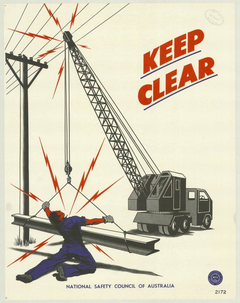
Bold typography and a stark warning dominate this National Safety Council of Australia poster from the 1970s, with the command “KEEP CLEAR” slanted across an otherwise open field. A mobile crane swings a long steel beam close to overhead power lines, while red lightning bolts dramatize the invisible hazard of electricity. Rendered like an industrial illustration, the scene turns a split-second risk into a message that can be understood at a glance.
On the ground, a worker is shown caught in the danger zone as the suspended load and nearby cables threaten a deadly arc, underscoring why lifting operations demand strict exclusion areas. The limited palette—grays and blacks for machinery, vivid red for danger—mirrors the era’s direct, no-nonsense approach to workplace safety communication. Even without detailed background, the essentials are unmistakable: heavy equipment, live lines, and the consequences of getting too close.
Posters like this are a vivid reminder of how Australian safety campaigns used graphic design to shape everyday behavior in construction and industry. As cover art for a collection of National Safety Council of Australia posters from the 1970s, it highlights the period’s emphasis on prevention, clear instructions, and visual storytelling. For readers interested in workplace safety history, industrial design, and public health messaging, this piece captures how a few strong symbols could carry life-saving advice.