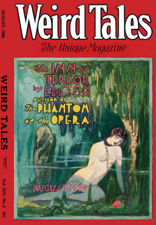
Bold red framing and oversized lettering make the August 1929 issue of Weird Tales impossible to miss, advertising itself as “The Unique Magazine” with the confidence of the pulp era. The cover promises dread at a glance, spotlighting the featured story title, “The Inn of Terror,” and the name Gaston Leroux, noted here as the author of The Phantom of the Opera. Even the small details—the volume and issue numbering and the 25¢ price—anchor it firmly as a mass-market magazine meant to be grabbed off a newsstand.
At the center, the illustration pulls the reader into a shadowy waterscape where green-black rock and hanging forms suggest a cavern or underground grotto. A pale figure drifts half-submerged near the foreground, posed with theatrical tension that plays to the era’s taste for melodrama and mystery. The contrast between lurid color, soft brushwork, and ominous setting sells the promise that the stories inside will blur beauty and danger.
Collectors and horror-fiction fans still chase Weird Tales covers like this for their blend of sensational art and literary history, capturing how early twentieth-century magazines marketed the uncanny. For anyone researching pulp illustration, magazine design, or the visual language of classic horror, this issue provides a vivid example of how typography, color, and figure painting worked together to hook readers. It’s also a reminder that long before modern horror branding, Weird Tales was already packaging fear as irresistible entertainment.