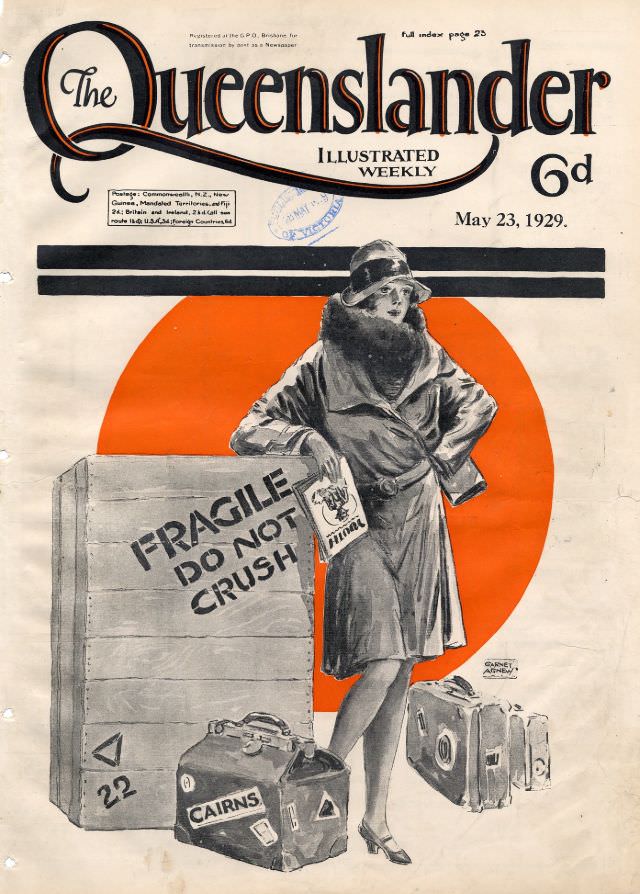
Bold lettering announces *The Queenslander* as an “Illustrated Weekly,” with the cover dated May 23, 1929 and priced at sixpence. The design balances crisp typography with a striking block of colour: a large orange-red circle that throws the central figure into sharp relief and gives the page a modern, poster-like punch. Even before you take in the scene below, the masthead and layout signal a publication competing for attention on the newsstand in late-1920s Australia.
At centre stands a fashionable traveller in coat and cloche-style hat, posed with the confidence of the era’s city chic while surrounded by the practicalities of movement. A big wooden crate shouts “FRAGILE DO NOT CRUSH,” and a cluster of suitcases and travel cases—one marked “CAIRNS”—ground the illustration in the realities of long journeys and mail or freight handling. The contrast between elegance and logistics makes the cover art feel like a small story about mobility, modern life, and the romance (and inconvenience) of getting from one place to another.
Collectors and researchers will appreciate how this illustrated front cover captures the look of Australian magazine art between the wars, when bold graphic elements and stylish figures were used to frame everyday themes. For anyone searching Queensland history, *The Queenslander* covers, or 1920s Australian illustration, the details here—price, date, and the travel motif—offer rich keywords and visual clues. It’s a memorable piece of cover art that hints at readerships interested in news, culture, and the expanding horizons of travel and commerce.