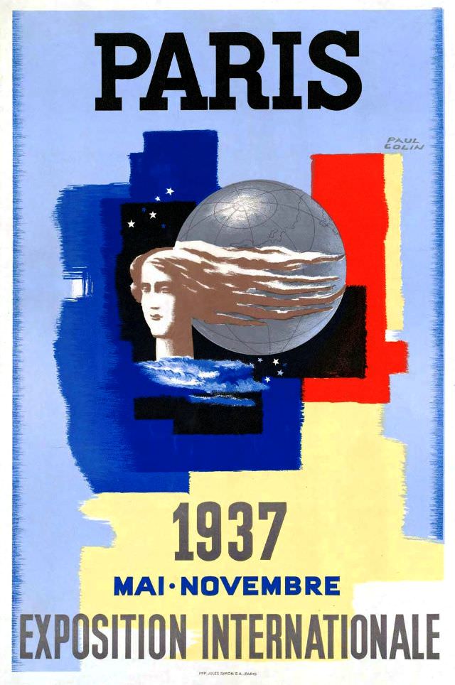
Bold lettering crowns the design with “PARIS,” immediately setting a confident, cosmopolitan tone for the 1937 International Exposition. Broad, painterly blocks of blue, black, red, and pale yellow create a modernist stage where a classical profile and a metallic globe share the spotlight. The figure’s flowing hair seems to sweep across the sphere, a striking visual metaphor for ideas, travel, and culture moving across borders.
Reading closer, the French tricolor on the right anchors the poster in national identity while the dark field dotted with stars suggests a night sky—or a broader world—behind the central motif. The cool gray of the globe, etched with faint map lines, balances the warmth of the surrounding colors and reinforces the exposition’s international ambition. “Mai–Novembre” and “Exposition Internationale” at the bottom frame it as both invitation and announcement, the typography as purposeful as the artwork itself.
As cover art, this piece captures the optimism and sleek graphic language associated with interwar Paris, when design leaned into streamlined forms and symbolic imagery. It also works beautifully as a SEO-friendly visual reference for anyone searching Paris International Exposition 1937 posters, French exposition art, or Art Deco–era advertising. Whether you’re studying exhibition history or collecting vintage travel and fair ephemera, the composition offers a compact, memorable snapshot of how Paris presented itself to the world.