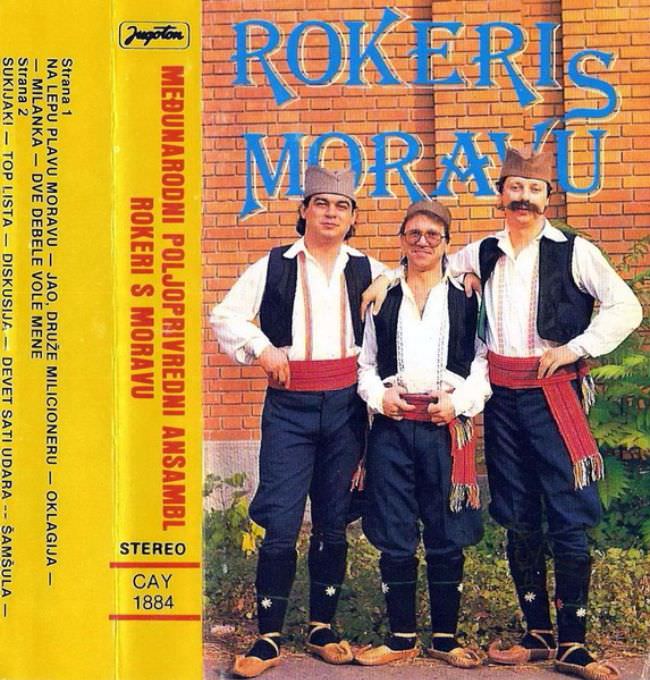
Bold, blocky lettering shouts “ROKERI S MORAVU” across a brick wall backdrop, setting the tone for a kind of Yugoslav-era cover art that prized clarity over subtlety. Three band members stand front and center in traditional-style clothing—vests, wide sashes, and caps—posed with the stiff confidence of a studio portrait transplanted outdoors. The overall effect is straightforward and promotional, more like a local poster than the mood-driven packaging that dominated Western record sleeves of the same decades.
Along the left edge, the cassette-style layout doubles down on function: a vertical column of text, track names, and the unmissable “STEREO” label crowd the design like a product specification sheet. That utilitarian strip, paired with the bright yellow band of color, turns the cover into something you can “read” as much as look at, which is exactly why these releases can feel blunt to modern eyes. It’s a reminder that much of 1970s and 1980s Yugoslav album and cassette art was built for quick recognition in shops, not for lingering contemplation.
Yet the so-called ugly truth is also a clue to the culture that produced it—regional identity made visible, humor and plain speech favored over abstraction, and performers presented as approachable, almost neighborly. Even the slight awkwardness in pose and typography becomes part of the charm, anchoring the music to everyday life rather than to distant glamour. For collectors hunting Yugoslavian cover art, this sleeve is a vivid example of how design, tradition, and mass-market practicality collided in the late socialist media landscape.