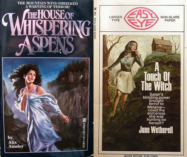
Stormy skies, jagged cliffs, and a woman caught mid-flight—these Gothic romance cover illustrations waste no time announcing danger. One scene frames a wind-whipped heroine in a pale dress as a dark, isolated house looms behind her, while bold, dramatic typography (“The House of Whispering Aspens”) sells dread as much as desire. The visual language is classic: moonlit blues, sharp silhouettes, and fabric that seems to move with the same unseen force that drives her away from the home.
Across the paired cover art, the “woman running from a house” motif becomes a psychological hook rather than mere melodrama. The fleeing figure suggests a split-second choice between curiosity and survival, pulling the viewer into questions the art refuses to answer: what happened inside, who is watching, and why is she alone? Even the second cover’s marketing frame and stark title block (“A Touch of the Witch”) amplify the push-pull of forbidden attraction and imminent threat that defines Gothic romance aesthetics.
Reading these images today reveals how cover art functioned as mood, promise, and warning all at once—selling suspense through body language, landscape, and architecture. The house is never just a backdrop; it’s a character, a trap, and a symbol of secrets that won’t stay buried, while the running woman embodies vulnerability sharpened into determination. For collectors and fans of vintage paperback design, this kind of Gothic romance cover art remains endlessly clickable because it visualizes fear in motion and invites the mind to fill in the story.