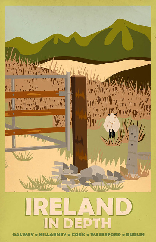
Green hills roll across the horizon while a simple gate, stone wall, and grazing sheep set a quiet rural rhythm in the foreground—an inviting slice of countryside rendered in bold, poster-ready shapes. The palette leans into soft creams and layered greens, the kind of stylized calm that travel advertising loved to promise: fresh air, open space, and a slower pace just beyond the road.
Centered near the bottom, the slogan “IRELAND IN DEPTH” anchors the design like a confident headline, with a line of place names beneath it—Galway, Killarney, Cork, Waterford, and Dublin—hinting at a journey that moves from coast to city and back again. Rather than overwhelm with landmarks, the cover art sells mood and texture: fields, fences, and the suggestion of mountains, all simplified to read instantly from a station wall or brochure rack.
Posters like this worked as miniature passports, using graphic clarity to spark daydreams and nudge real itineraries. In the context of “Around the World in Posters,” this piece stands as a reminder of how vintage travel advertising blended geography with romance, turning everyday pastoral details into an emblem of national character and an irresistible call to explore.