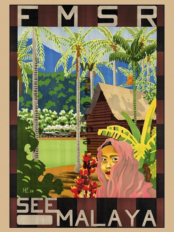
Bold lettering frames a lush tropical scene, where palms sway above dense greenery and a steep-roofed hut sits near the edge of a calm shoreline. In the foreground, a stylized figure in a pink head covering faces the viewer, while bright red blossoms punctuate the warm earth tones. The composition leans into flat, graphic color blocks that feel unmistakably like classic travel poster cover art—designed to be read at a glance and remembered.
At the top, “FMSR” is prominently set, and the sweeping slogan “SEE MALAYA” anchors the bottom, turning the illustration into an invitation as much as an advertisement. Beyond the vegetation, blue mountains rise under a pale sky, hinting at distance and adventure without overloading the viewer with detail. The artist’s simplified shapes and high-contrast palette sell an idealized “elsewhere,” balancing local motifs with an easy, modern readability.
Travel advertising of this era often traded in atmosphere—sunlit landscapes, curated architecture, and a sense of welcoming mystery—and this poster fits neatly into that tradition. For anyone interested in vintage travel advertising, poster design history, or the visual culture of tourism, it offers a compelling snapshot of how destinations were branded through color, typography, and selective storytelling. Paired with the post’s theme, it reinforces how cover art helped audiences imagine the world long before glossy magazines and social media feeds took over.