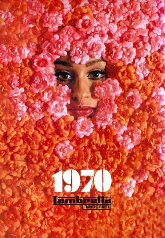
A pair of watchful eyes emerges from a dense field of blossoms, where pinks, corals, and fiery oranges crowd the frame like a living curtain. The styling feels unmistakably of 1970—bold color, graphic simplicity, and a flirtation with pop-art spectacle—turning a close-up portrait into an immersive pattern. Even without a visible setting, the photograph radiates the era’s taste for high-impact design and playful glamour.
Below the floral tide, the “1970” typography and the Lambretta branding anchor the image in the world of scooter culture and aspirational advertising. It’s a reminder that calendars were more than date-keepers: they were collectible posters, fashion statements, and marketing tools rolled into one. The contrast between soft petals and crisp lettering captures that late-1960s-to-early-1970s shift toward cleaner graphics paired with exuberant visual excess.
For readers interested in fashion and culture history, this piece offers a vivid snapshot of how beauty imagery, consumer brands, and print design converged at the start of a new decade. The model’s partially hidden face invites interpretation—mystery as allure—while the saturated palette does the heavy lifting of mood and memory. As a historical photo for a WordPress post, it’s instantly SEO-friendly for searches around “1970,” “Lambretta calendar,” “vintage advertising,” and “retro fashion photography,” yet it still leaves room for the imagination to fill in the soundtrack and street scene beyond the frame.