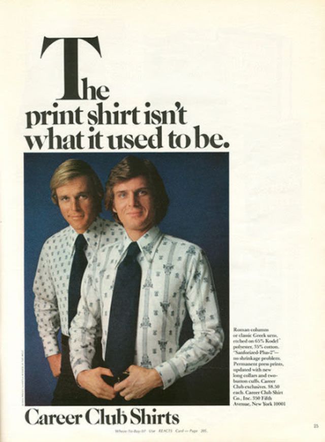
Bold typography dominates the page with the line “The print shirt isn’t what it used to be,” setting a self-assured tone that feels unmistakably ’70s. Beneath the headline, two clean-cut male models pose against a deep blue studio backdrop, their side-parted hair and relaxed expressions selling the era’s idea of polished modernity. The ad’s generous white space and magazine-like layout make the message easy to scan—an early lesson in fashion marketing designed for quick browsing.
Pattern does the heavy lifting here: light-colored button-downs sprinkled with small geometric motifs, paired with dark, wide ties that anchor the look in corporate respectability. The styling suggests a moment when menswear wanted to flirt with individuality without abandoning the office dress code, offering prints that read “fun” at a distance and “professional” up close. Even the poses—hands near the waist, shoulders squared—feel like a reassurance that you can experiment and still look employable.
At the bottom, the brand name “Career Club Shirts” lands like a promise, tying the playful prints to ambition and upward mobility. Ads like this now invite both laughter and nostalgia, not just for the patterns but for the earnest confidence of the copywriting. As a snapshot of 1970s fashion culture, it captures that sweet spot where groovy style meets boardroom aspiration, one tiny print at a time.