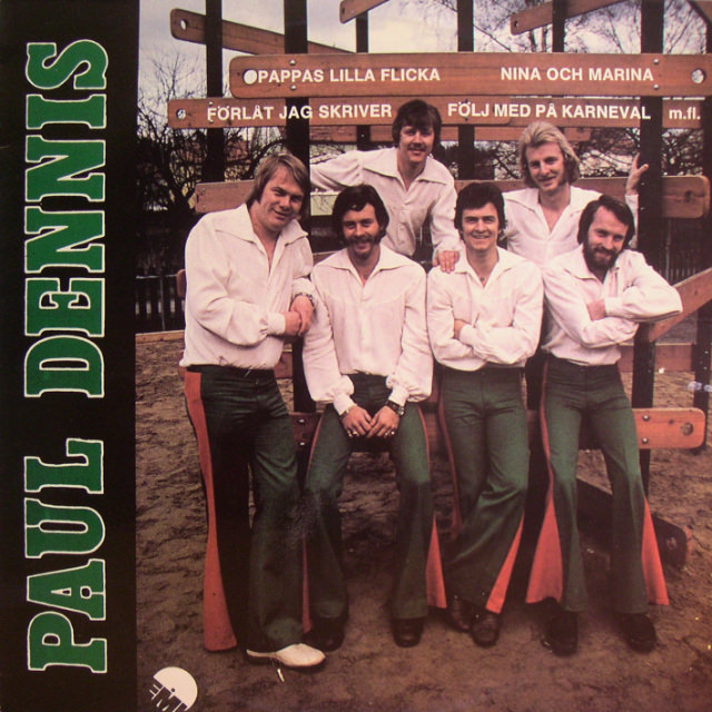
Bold block lettering along the edge announces a Swedish dance-band identity, while a playful wooden backdrop—part signpost, part playground—sets the tone for an album cover that treats everyday space as a stage. Across the top, Swedish song titles are painted like directional markers, lending the scene a touring-poster feel and turning casual outdoor scenery into a graphic, music-forward design. The overall look is bright and approachable, a snapshot of pop culture where typography and setting do as much work as the performers themselves.
Six men pose with easy camaraderie in matching open-collar white shirts and fitted green trousers, a uniform that reads as both clean-cut and subtly daring. The styling leans into the era’s confident masculinity: sharp silhouettes, wide belts, and distinct haircuts and facial hair that give each member an individual signature without breaking the group’s cohesion. Their relaxed stances—arms folded, hands in pockets, a shoulder leaned in—sell the band as friendly and accessible, the kind of act meant for dance halls, radio requests, and family living rooms.
As a piece of vintage Swedish music fashion, the cover captures how album imagery once doubled as a wardrobe catalog and a promise of personality. The coordinated outfits suggest professionalism and polish, yet the outdoor setting and playful props keep it grounded in everyday life, bridging glamour and familiarity. For collectors of Scandinavian pop history, retro menswear, and classic album cover design, it’s a vivid reminder of when style, marketing, and melody were packaged together as one irresistible cultural artifact.