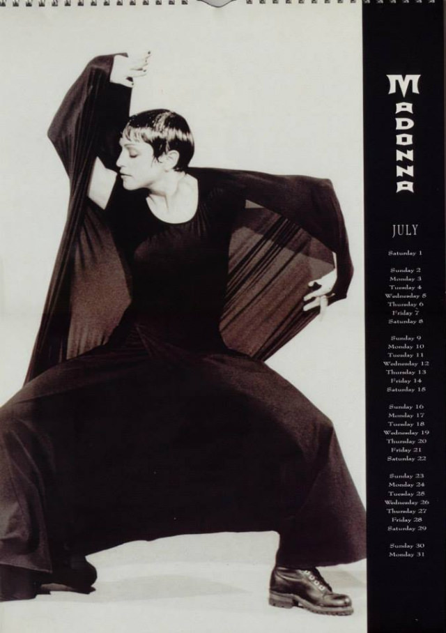
A stark, studio-lit calendar page places Madonna in a dramatic, dance-like pose, her cropped hair and intent profile set against a nearly blank backdrop. Draped in an all-black outfit with wide, flowing fabric that reads like wings, she stretches one arm overhead while the other anchors the composition, turning fashion into choreography. Heavy lace-up boots ground the look, adding a gritty, streetwise edge that contrasts with the clean, graphic minimalism.
Along the right margin, bold vertical lettering spells out “MADONNA,” and the month “JULY” sits above a tidy list of dates, reminding you this is pop iconography designed for everyday life. The layout feels quintessentially 1990s: high-contrast monochrome, strong negative space, and typography that doubles as branding. It’s a piece of merchandise, yes, but also a carefully art-directed portrait that borrows from editorial photography and performance imagery.
Official calendars from the 1990s functioned as monthly mini-posters, bringing celebrity fashion and culture into bedrooms, dorms, and offices with a flip of the page. Here, the emphasis is on silhouette and attitude—less glitter, more precision—reflecting an era when Madonna’s image could pivot between glamour, provocation, and avant-garde restraint. Seen now, the page reads like a time capsule of 1990s style: wearable drama, graphic design confidence, and a star who understood how to turn a simple calendar into a collectible statement.