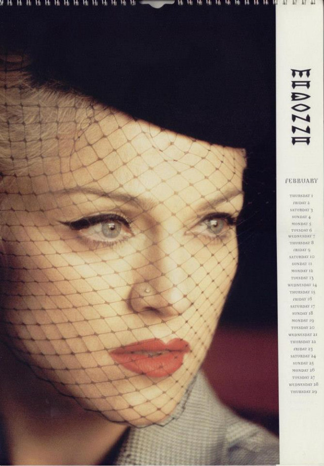
A close-up portrait fills the page, framed like a calendar leaf with a spiral binding along the top and a neat column of dates running down the right side. The subject’s gaze turns slightly off-camera, blue eyes sharpened by smoky liner, while a delicate net veil casts a faint lattice over the face. Deep red lipstick and smooth, studio-lit skin create a high-glamour contrast that feels tailored for a collectible official calendar rather than a casual snapshot.
The styling nods to 1990s fashion culture, where pop stardom and editorial polish often met in bold, cinematic looks. A dark hat and the veil’s retro texture evoke classic Hollywood, yet the overall finish—clean typography, tight crop, and emphasis on attitude—reads unmistakably modern for that era’s celebrity merchandising. Even without a full scene, the image communicates persona: controlled, iconic, and carefully curated for fans flipping through months on their wall.
Along the margin, the vertical calendar title and a month layout (February visible) reinforce how these official releases functioned as both timekeepers and pop artifacts. Calendars like this turned everyday routines into a gallery of themed portraits, packaging music-industry mythology into something you could hang at home or in a studio. As a look back at Madonna’s 1990s official calendars, the page reflects how fashion, photography, and branding converged to keep an image in constant circulation.