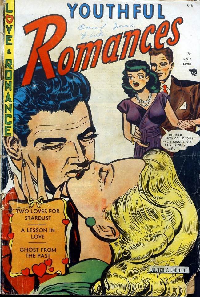
Bold lettering and bigger-than-life faces pull you straight into the melodrama of a pulp romance cover, where the title “Youthful Romances” practically shouts from the page. A blonde heroine tilts into a kiss with a dark-haired man, rendered in thick ink lines and saturated color that make every gesture feel urgent. Along the margin, the promise of “LOVE! ROMANCE!” is delivered like a carnival barker’s call, setting the tone before a single panel is turned.
Over the couple’s shoulders, a sharply dressed pair looks on, and a speech bubble turns the scene from sweet to sharp: “Oh, Rick… how could you… I thought you loved only me.” That one line explains why covers told their own story—jealousy, betrayal, and instant stakes, all compressed into a single glance. Even the blurbs at the bottom—teasing stardust, lessons, and ghosts from the past—work like miniature trailers, selling not just a comic but an emotional roller coaster.
Wear and creases along the edges hint at a life beyond the newsstand, the kind of handling that turns cheap paper into a small historical artifact. For readers and collectors of vintage comics, romance pulp, and mid-century illustration, this cover is a lesson in marketing through storytelling: typography, color, and cliffhanger dialogue doing the work of a whole plot. It’s funny, yes, but also revealing—proof that a well-designed cover could hook an audience before the first page ever began.