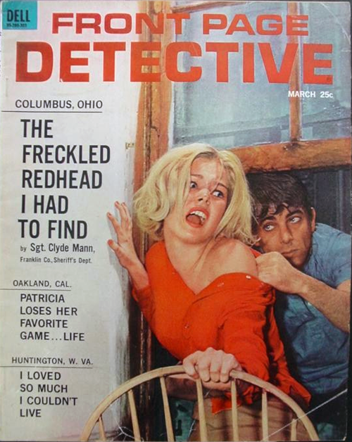
Pulp drama leaps off the cover of *Front Page Detective*, where bold headlines and breathless copy promise scandal, danger, and a tabloid-style thrill ride. The typography and layout mimic a newspaper front page, leaning into mid-century crime-magazine marketing that sold suspense as everyday reading. Even before you linger on the scene, the words “Patricia Loses Her Favorite Game… Life” set a darkly comic hook that matches the post’s playful tone.
A blonde woman in a vivid red off-the-shoulder top recoils in alarm as a man crowds close behind her, his grip and posture suggesting menace and pursuit. The tight framing, exaggerated expressions, and doorway setting create that unmistakable staged tension typical of detective and true-crime covers, designed to stop a passerby cold at the newsstand. Color, contrast, and melodrama do the heavy lifting, turning a single moment into a full cliffhanger.
Collectors and pop-culture historians love pieces like this because they reveal how sensational storytelling was packaged—half morality play, half entertainment, and entirely optimized for attention. The cover’s mix of “front page” realism and theatrical posing reflects an era when crime narratives were consumed as quick, addictive episodes. Whether you read it as kitsch, cautionary tale, or retro design inspiration, it’s a sharp reminder of how magazines once sold fear and fascination in the same loud breath.