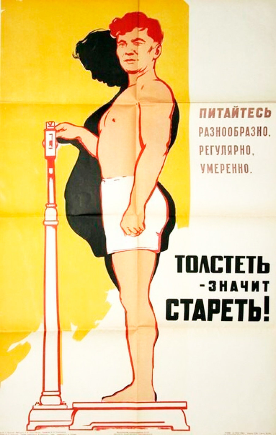
Bold color and blunt typography turn this artwork into a public health warning: a man stands on a scale, his profile doubled by a dark, swollen shadow that hints at weight gain overtaking the body. The background’s sunny yellow makes the message feel urgent rather than somber, while the simplified lines and strong contrast place the emphasis on shape, measurement, and consequence. Even without naming a place or era, the poster’s didactic style reads like classic mass communication—designed to be understood at a glance.
Printed text in Cyrillic drives the point home with moral certainty, urging viewers to “eat diversely, regularly, moderately,” and ending with the sharp slogan that “getting fatter means getting older.” The scale becomes more than a device; it’s a symbol of modern discipline, where everyday habits are framed as a duty to oneself and society. Here, food isn’t celebrated for pleasure or tradition—it is managed, scheduled, and rationed in the name of longevity.
For a WordPress post about historical posters, nutrition messaging, or propaganda-era graphic design, this image offers a revealing snapshot of how health education once spoke to the public. Its straightforward visual metaphor still resonates in today’s debates about diet culture, aging, and body image, reminding us that advice about “moderation” often arrives wrapped in fear. Viewed as an artwork, it’s also a lesson in economy: one figure, one shadow, one scale, and a slogan that refuses to whisper.