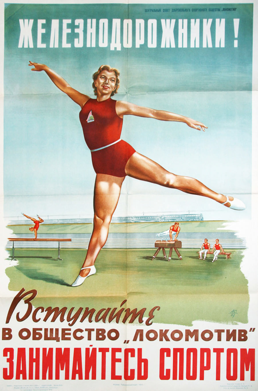
Bold Cyrillic lettering calls out to “Railroad workers!” above a poised athlete in a red training kit, her arms extended in a balletic, gymnastic stance that signals discipline and confidence. The poster’s clean sky-blue background and heroic scale give the figure a larger-than-life presence, turning physical culture into an ideal to aspire to rather than a pastime. Across the bottom, the slogan urges viewers to join the “Locomotive” society and take up sport, blending workplace identity with an upbeat promise of strength and community.
Along the horizon sits a long train and the suggestion of rail infrastructure, a visual reminder of the industry the message addresses. In the foreground, smaller scenes of exercise—balance work and apparatus training—hint at organized club facilities and coached routines, not just casual play. The composition links the rhythm of the railway with the rhythm of training, presenting athletic improvement as something practical, collective, and modern.
Seen today, this historical sports propaganda artwork reads as more than a fitness advertisement; it’s a snapshot of how institutions encouraged workers to build bodies that matched the era’s ideals of productivity and readiness. For readers interested in Soviet-era design, labor history, or the culture of workplace sports clubs, the image offers a vivid example of how typography, color, and motion were used to recruit members and shape everyday life. It also makes a striking WordPress feature image for posts exploring the “Locomotive” club, railroad worker communities, and the broader story of organized sport in the industrial world.