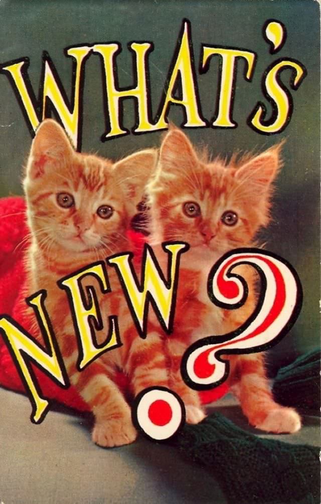
Two wide-eyed ginger kittens steal the spotlight on this cheeky postcard, framed by oversized lettering that blurts out “WHAT’S NEW?” with a dramatic, curling question mark. The studio-style backdrop and bold, hand-drawn typography feel like a mash-up of greeting card sweetness and accidental comedy, as if the card can’t decide whether it’s a friendly hello or a tiny shout. It’s cute, yes—but the exaggerated design choices make it delightfully awkward in exactly the way bad vintage postcards do best.
Humor like this wasn’t always meant to be ironic; novelty postcards often leaned hard into big expressions, bright colors, and animals posed as stand-ins for human conversation. Here, the kittens’ earnest little faces collide with the loud, attention-grabbing text, creating that familiar “wish you were here” energy—even though nothing about it says where “here” is. The result is a time-capsule of everyday correspondence, when a quick laugh and a simple message could travel farther than any carefully curated photo.
Nostalgia runs through the whole piece, from the slightly worn print quality to the theatrical font that practically performs on the page. For collectors of vintage postcards and lovers of retro ephemera, it’s a perfect example of how well-meaning design can age into unintentional hilarity. Drop it into your scroll of hilariously bad postcards and it becomes a reminder that awkwardness, like a good postcard, has always been meant to be shared.