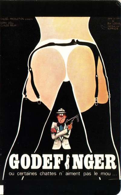
Bold graphic design meets cinematic mischief in this cover art for “Goldfinger,” where a stark A‑frame silhouette frames the entire composition. Heavy black fields, clean curves, and high-contrast negative space pull the eye inward, turning a provocative outline into a visual doorway that guides attention to the figure below. Even without a literal runway or studio setting, the pose reads instantly—an icon of stylized confidence that feels engineered for maximum poster impact.
What makes the A‑frame so enduring is its geometry: a wide, stable base that narrows to a strong central axis, creating symmetry, tension, and a clear focal path. Designers and photographers have long relied on this stance (and variations of it) to suggest glamour, dominance, or playful danger, depending on the context. Here, the structure of the pose becomes part of the storytelling, transforming anatomy and attitude into a crisp emblem that’s as much about composition as it is about character.
Modern fashion editorials, album covers, and movie posters still echo this same visual logic—silhouette-first simplicity, bold framing, and a pose that reads at a glance even from across a street. The minimal palette and exaggerated shapes anticipate today’s poster trends, where clean lines and dramatic contrast perform well on screens and in social feeds. For anyone tracing the history of the A‑frame’s influence, this piece offers a vivid reminder that a single stance can become a recurring design language across decades of art and advertising.