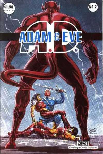
Towering legs frame the entire scene as a horned, red figure stands with a commanding stance, turning the body itself into an architectural border. That wide-set posture—so close to a literal “A” shape—pulls your eye downward to the drama at the figure’s feet, where two costumed characters sprawl in the rain. Over the top, bold typography spells out “ADAM & EVE,” making the cover a clean case study in how pose, scale, and type can lock together into an instantly readable design.
What makes the A-frame so enduring is the way it creates a stage: negative space becomes a doorway, and whatever sits between the legs is automatically the “story.” Here, the heroic and fallen bodies below feel smaller, more vulnerable, and more cinematic precisely because the foreground stance is so stable and monumental. The rain, high contrast colors, and sharp musculature amplify that poster-like tension—part tableau, part confrontation, all built on a simple compositional trick.
Modern fashion editorials, gallery photography, and movie posters keep returning to this arrangement because it communicates power without dialogue and hierarchy without captions. A single figure in an A-frame pose can suggest dominance, spectacle, and even menace, while also guiding the viewer to the focal point like a visual arrow. For readers tracing the A-frame’s influence across media, this “Cover Art” example offers a punchy reminder: the body’s geometry can be as iconic as any logo.