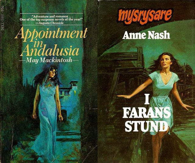
Two striking paperback covers sit side by side, both leaning into the Gothic romance tradition of danger at the doorstep and the heroine poised between flight and fascination. On the left, *Appointment in Andalusia* (May Mackintosh) sets a lone woman in a long, pale-blue dress against a moody, teal-and-shadow palette, her posture tense as architecture looms behind her. On the right, Anne Nash’s *I FARANS STUND* places a woman mid-motion, arms out as if bracing herself while a dark house presses in from the background, the drama heightened by bold typography and stark contrasts.
What makes the “woman running from the house” motif so psychologically sticky is the way it stages a conflict the reader can feel instantly: safety versus curiosity, reason versus desire, the known world versus whatever waits in that dark interior. These covers don’t need explicit monsters or villains; the building itself becomes an emotional antagonist, a symbol of secrets, inheritance, and threat. The heroine’s body language—half escape, half compelled approach—invites the viewer to step into a narrative of suspense where romance is inseparable from risk.
For collectors of vintage Gothic romance cover art, scenes like these are a visual shorthand for the genre’s promises: high tension, haunted settings, and a woman’s interior life rendered as exterior action. The saturated greens and blues, the shadowed windows, and the anxious glance over a shoulder function as SEO-friendly cues for anyone searching Gothic paperback covers, romantic suspense illustration, or classic women-in-peril imagery. Taken together, these designs show how mid-century publishing used a single, unforgettable scenario to sell mood, mystery, and the irresistible pull of the unknown.