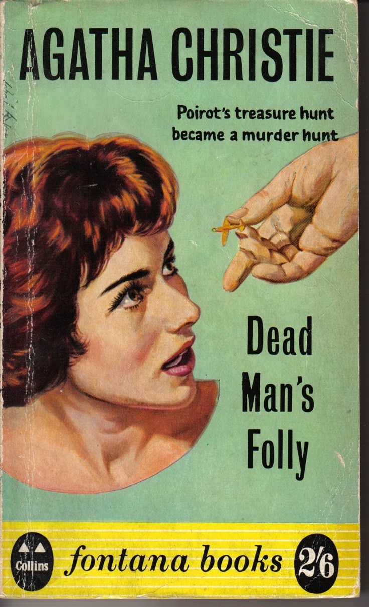
Bold lettering shouts “AGATHA CHRISTIE” across a sea-green background, instantly placing this cover art in the confident, high-contrast graphic style readers associate with mid-century crime fiction. Below it, the tagline—“Poirot’s treasure hunt became a murder hunt”—sets the stakes with brisk economy, promising the familiar pivot from game to danger that makes Christie’s plots so compulsively readable. The title, *Dead Man’s Folly*, sits stark and vertical, leaving no doubt about the grim turn waiting beneath the surface.
A close-up illustrated profile of a woman dominates the design, her gaze lifted toward a hand that hovers above her with a tiny object poised between fingers. That suspended gesture—part offering, part threat—creates immediate tension, like a clue about to be planted or a secret about to be revealed. Warm reds and browns in the hair and skin tones pull against the cool background, a color contrast that heightens suspense even before a page is turned.
At the bottom, the “fontana books” imprint and price marking (“2/6”) anchor the piece as a UK paperback artifact from the 1950s publishing world, complete with visible wear that speaks to real circulation and repeated handling. As a historical snapshot of cover design for *Dead Man’s Folly* (first published in the UK in 1956), it captures how publishers sold mystery through suggestion: a face, a hand, a hint of peril, and a promise of Poirot. For collectors and Christie enthusiasts alike, this is the sort of cover art that turns a bibliographic detail into a tangible story object.