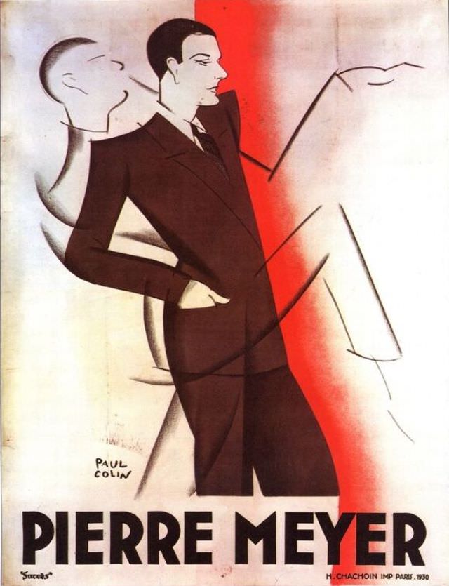
Strikingly modern for 1930, the cover art for “Pierre Meyer” leans into bold geometry and theatrical poise: a sharply dressed man in a dark suit stands with one hand in his pocket, his profile turned toward a sweeping, simplified figure rendered in pale tones. A vertical band of red slices through the composition, acting like a spotlight or stage curtain, while the surrounding whites and blacks keep the focus on silhouette and attitude rather than detail.
The design speaks the visual language of interwar poster art—clean lines, confident typography, and a sense of motion created through overlapping forms. The name “PIERRE MEYER” anchors the bottom in large, heavy lettering, making the subject impossible to miss and reinforcing the piece’s function as promotional cover art rather than a conventional portrait. The artist’s signature and small-print credits hint at a professional print run, inviting viewers to read it as a product of its publishing world as much as an artwork.
For collectors and historians, this 1930 Pierre Meyer cover offers a vivid window into how elegance, masculinity, and modernity were marketed through graphic design in the early twentieth century. The limited palette and stylized figures feel poised between fine art and advertising, where personality is suggested through posture, contrast, and typography. As a WordPress feature image, it’s also wonderfully SEO-friendly: a classic “Pierre Meyer 1930” cover that illustrates the era’s poster aesthetics with immediate, unforgettable impact.