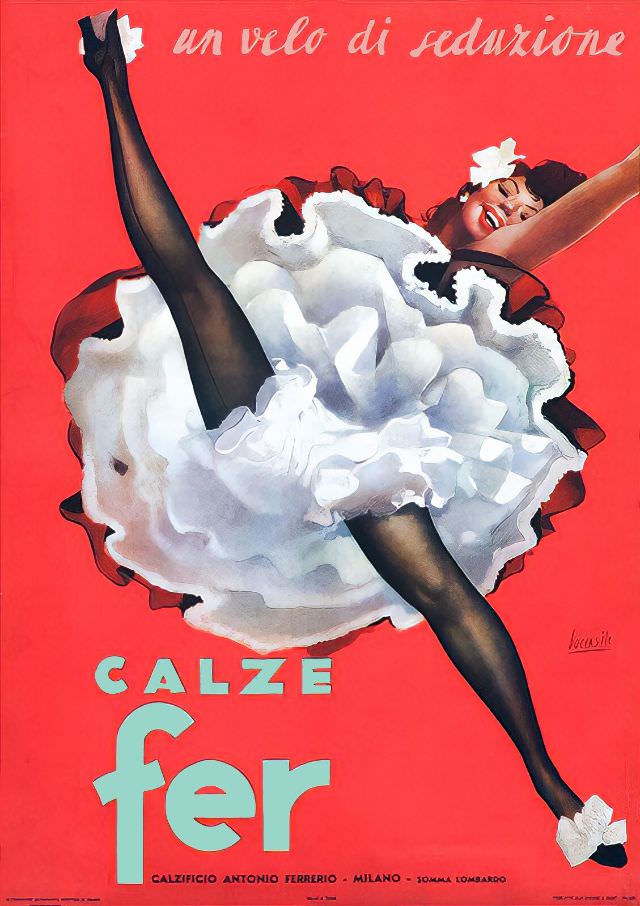
A burst of saturated red sets the stage for an exuberant mid-century advertising illustration titled “Calze Fer, Un velo di Seduzione,” evoking the glamour and confidence often associated with the circa-1940s aesthetic. The central figure is caught in a theatrical, dance-like kick, her dark stockings framed by a cloud of white ruffles and a bright, smiling expression. Above, the Italian slogan “un velo di seduzione” (“a veil of seduction”) floats like a promise, turning hosiery into something playful, modern, and aspirational.
Typography and composition do much of the persuasive work: the bold “CALZE fer” anchors the lower portion while the sweeping diagonal of the legs pulls the viewer’s eye across the poster. The contrast between inky, sheer hosiery and the airy lightness of the dress creates a visual argument for elegance—suggesting that the product is both delicate and dramatic. Even the small details, like the white accents at the shoes, reinforce a carefully choreographed image of style in motion.
Seen today, this Calze Fer poster reads as more than an advertisement; it’s a snapshot of consumer culture and graphic design history, when fashion marketing leaned on theatrical charm and idealized femininity. For collectors and readers interested in Italian vintage posters, 1940s-inspired illustration, and the evolution of lingerie and hosiery advertising, it offers a striking example of how seduction was packaged through color, gesture, and a few well-chosen words. The hint of Milan in the lower text further ties the piece to Italy’s long-standing relationship with fashion and print design.