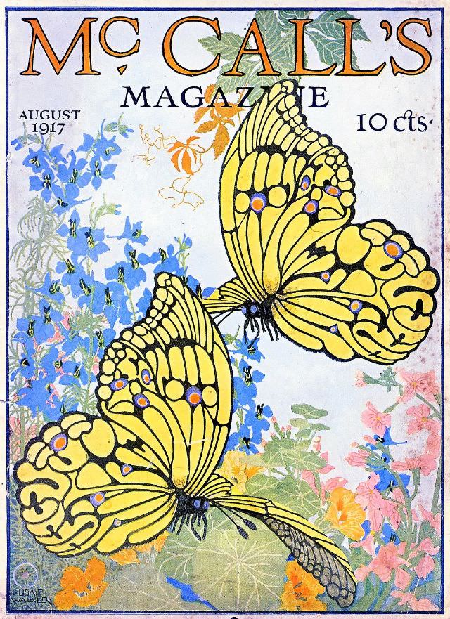
Bright, stylized butterflies sweep across the August 1917 McCall’s magazine cover, their lemon-yellow wings outlined in bold black and dotted with jewel-like accents. Behind them, a lush scatter of summer flowers—cool blues, soft pinks, and warm oranges—creates a garden backdrop that feels both delicate and decorative. The masthead “McCALL’S MAGAZINE” crowns the composition, while “AUGUST 1917” and the price “10 cts” anchor it firmly in its moment.
The design leans into the era’s love of clean contours and ornamental nature, turning a fleeting outdoor scene into something poster-like and enduring. Even without people or city streets, the cover suggests a season of lightness: fluttering motion, layered petals, and a careful balance of color that would have stood out on a newsstand. It’s a reminder that magazine cover art was meant to sell a mood as much as an issue.
Collectors and historians often look to publications like McCall’s for everyday visual culture, and this cover delivers it in full—typography, illustration, and consumer detail all in one frame. For anyone researching early 20th-century magazine covers, vintage advertising aesthetics, or the evolution of American print design, the August 1917 issue offers a vivid example of how nature motifs and modern graphic style met on the page. Consider it a small window into what captured attention in 1917, preserved in ink and color.