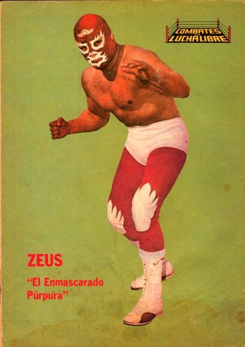
Against a flat green backdrop, a masked luchador steps forward in a fighter’s crouch, hands raised as if the next strike is already in motion. The cover balances simplicity with spectacle: purple-red gear, white trunks and boots, and a face mask that turns identity into myth. In the corner, the “Combates Lucha Libre” logo stamps the scene like a marquee, while the bold caption “ZEUS” and the nickname “El Enmascarado Púrpura” sell the persona as much as the match.
Magazine cover art like this helped define 1970s lucha libre culture on the newsstand, where wrestlers weren’t just athletes—they were characters built from color, pose, and promise. The clean studio-style composition strips away the arena so the mask can do its work, making the figure feel larger than life and instantly recognizable at a glance. Even without a specific bout or venue named, the design speaks in the language of lucha libre: bravery, pageantry, and the tease of violence held just off-frame.
For collectors, historians, and fans of Mexican wrestling history, these covers are time capsules of popular taste and graphic style. The typography, the saturated palette, and the hero-shot stance all point to an era when print media amplified ring legends week after week. Browse this visual tour for the grit and glamour implied in every detail—blood, masks, and glory distilled into a single, unforgettable piece of lucha libre magazine cover art.