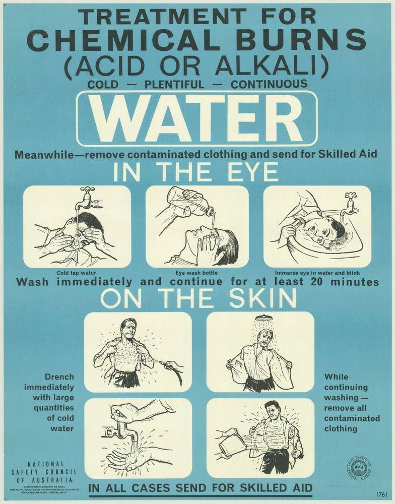
Bold typography and a cool blue field pull the reader straight into a no-nonsense lesson: “TREATMENT FOR CHEMICAL BURNS (ACID OR ALKALI).” The poster’s central command—WATER—appears in oversized lettering, backed by the brisk rhythm of “cold – plentiful – continuous,” a slogan-like triad that reflects the National Safety Council of Australia’s 1970s approach to public education. It’s cover art with purpose, designed to be read quickly in a workplace, lab, or first-aid area where seconds matter.
Across the middle, simple line drawings break emergency response into clear, repeatable steps for “IN THE EYE” and “ON THE SKIN.” The illustrations show flushing with cold tap water, using an eyewash bottle, immersing and blinking, and drenching exposed areas—paired with practical instructions to wash immediately and continue for at least 20 minutes. Alongside the urgency of rinsing runs another firm directive: remove contaminated clothing and “send for Skilled Aid,” underscoring how these posters balanced do-it-now actions with professional follow-up.
Designed as a visual message for keeping people safe and well, the layout prioritizes legibility, sequence, and calm authority over decoration. The combination of large headline text, boxed panels, and repeated emphasis on water captures a distinctly 1970s safety-communication style—direct, instructional, and meant for everyday visibility. For anyone researching Australian safety posters, industrial health messaging, or the history of first-aid education, this piece offers a vivid example of how prevention and response were translated into graphic design.