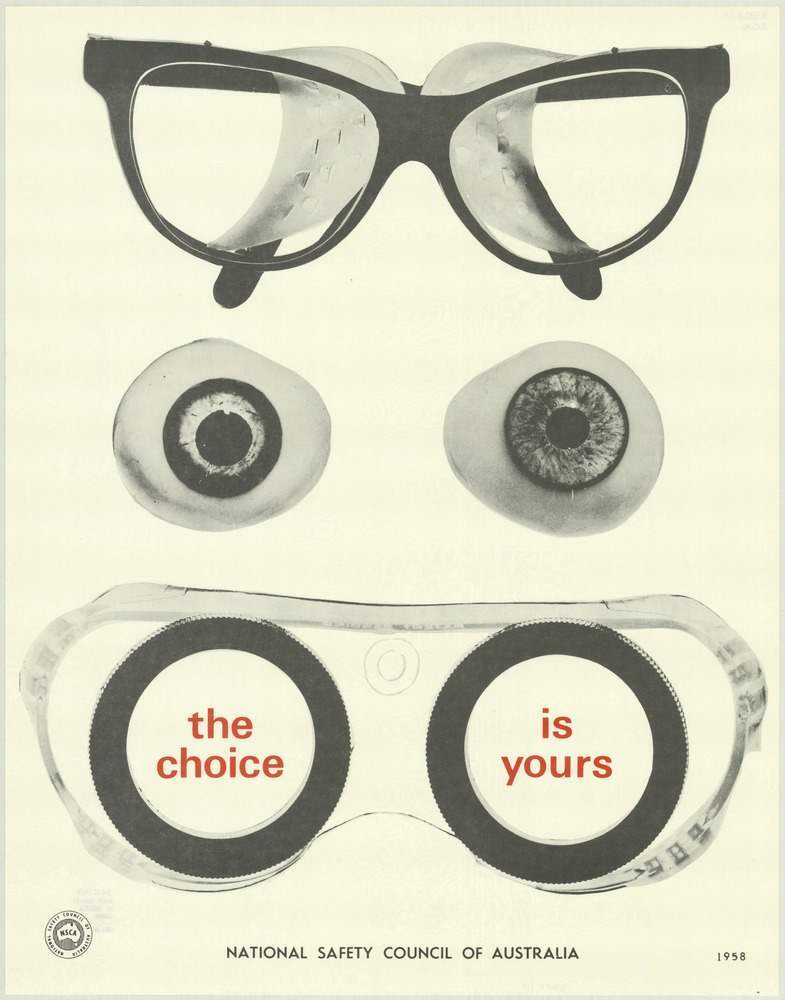
Oversized spectacles hover at the top of the design, while a pair of watchful eyes and a set of protective goggles below create a face-like arrangement that’s hard to forget. The poster’s clean, almost clinical background leaves the viewer nowhere to look but at the tools of vision and protection, turning everyday objects into a memorable safety message. Even without a crowded scene or dramatic accident, the composition quietly suggests how quickly sight can be lost—and how easily it can be guarded.
Bold red words inside the goggle lenses—“the choice” on one side and “is yours” on the other—deliver the campaign’s moral with brisk clarity. That restrained palette, combined with crisp typography and a spare layout, feels characteristic of public health and workplace safety graphics from the era: direct, instructive, and designed for instant comprehension at a glance. The National Safety Council of Australia branding at the bottom anchors the piece as an official appeal to personal responsibility.
As cover art for a collection of National Safety Council of Australia posters from the 1970s, this image points to the period’s reliance on strong visual metaphors to promote safe habits. It’s an SEO-friendly snapshot of Australian safety poster design, linking themes of eye protection, industrial wellbeing, and preventive thinking in one striking frame. Readers interested in vintage Australian ephemera, graphic design history, or the evolution of workplace safety messaging will find plenty to unpack in its simple, compelling logic.